KwikIQ Branding
We made a smart brand look smart.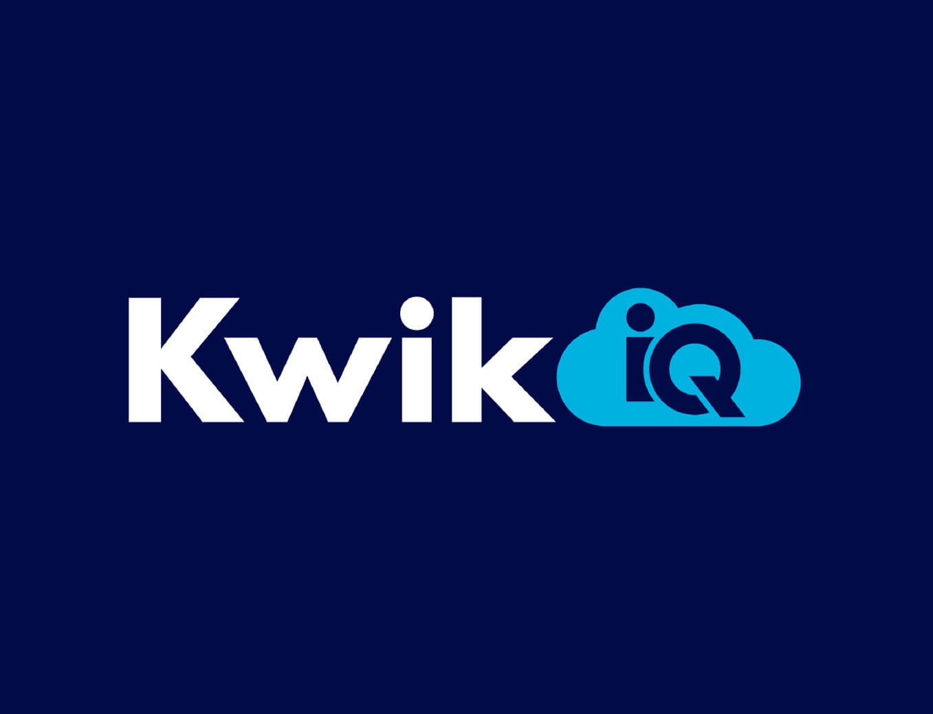
KwikIQ Branding
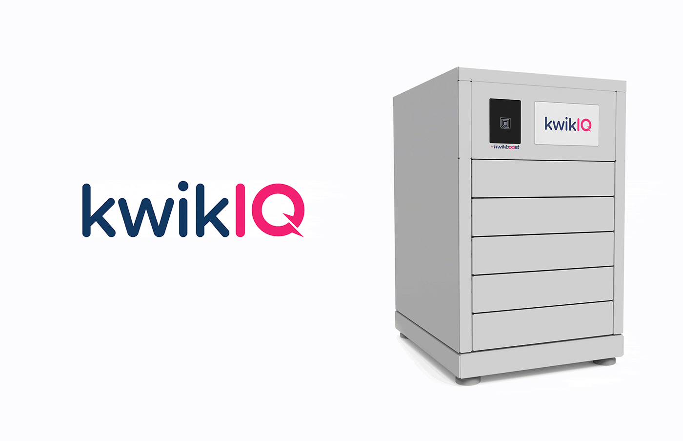
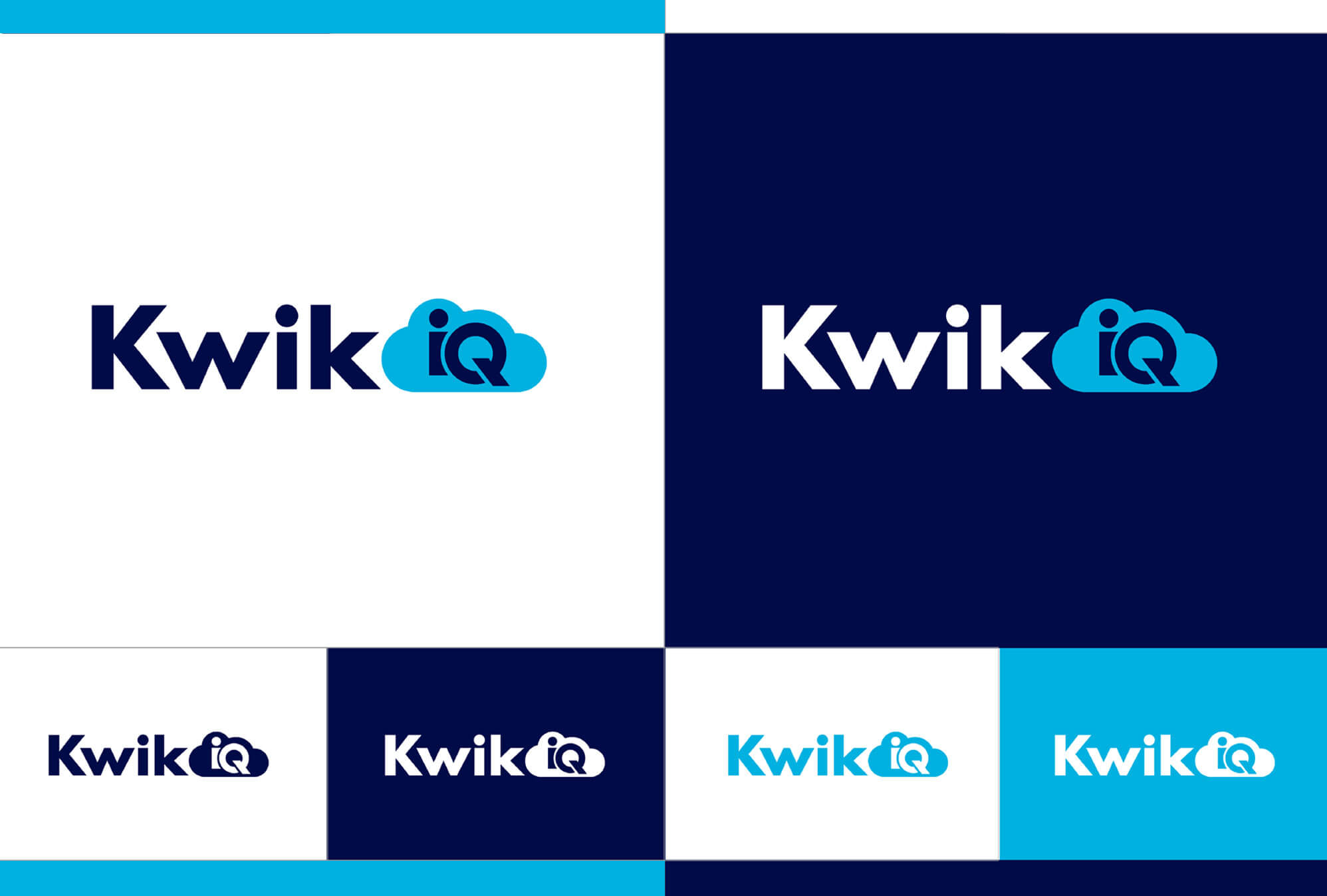
Kwik IQ is a leader in cloud-based smart, secure digital device management, storage and charging. But old branding told an outdated story. So, the company turned to Pivot for a new look that demonstrates Kwik IQ’s reasons to believe. First, we created a stronger tech brand that’s undergirded with a solidly built typeface and makes better use of the company’s navy blue. Then, to drive home Kwik IQ’s chief point of differentiation, we placed the “IQ” in a cloud for a “kwik” read.
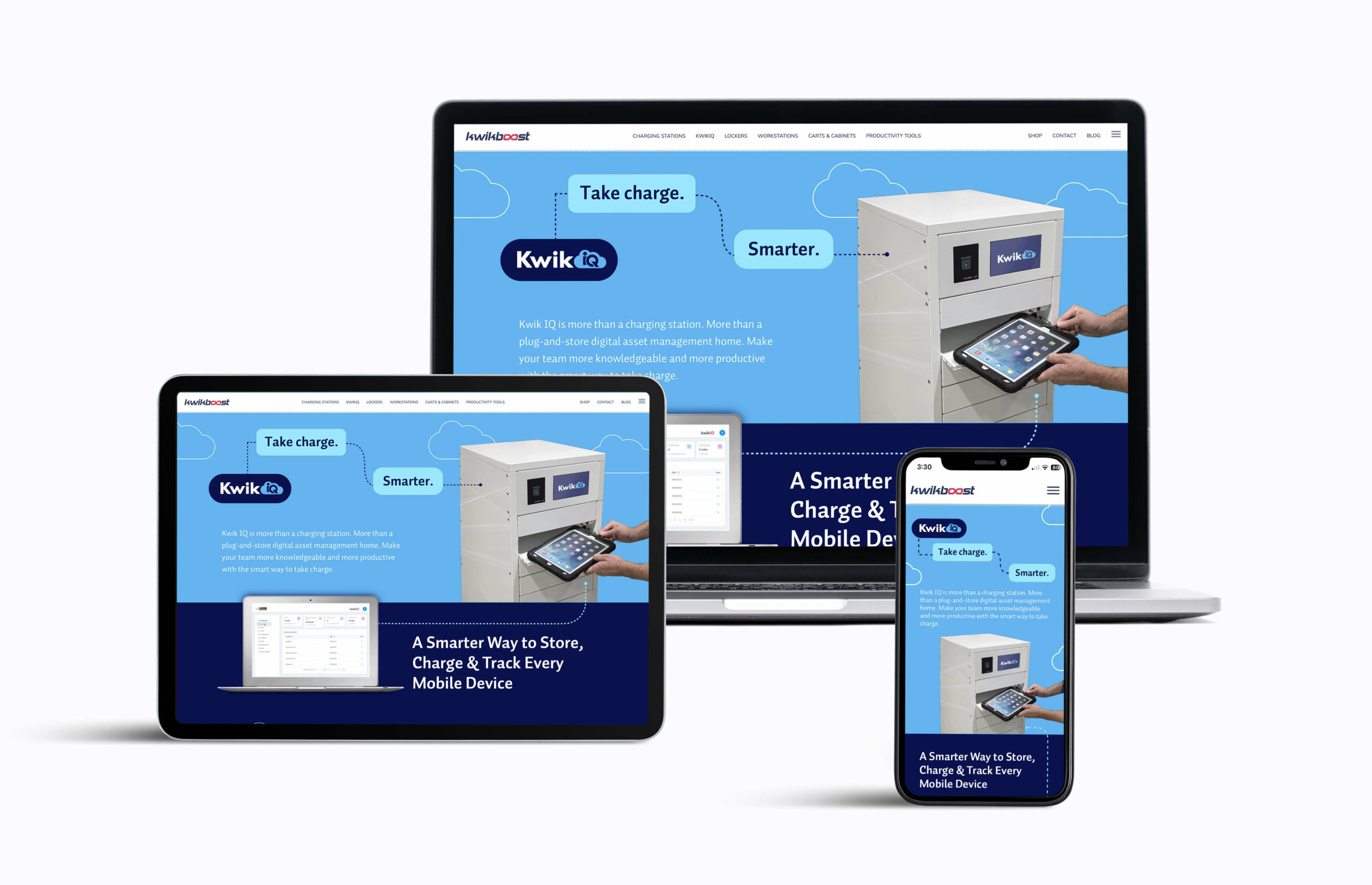
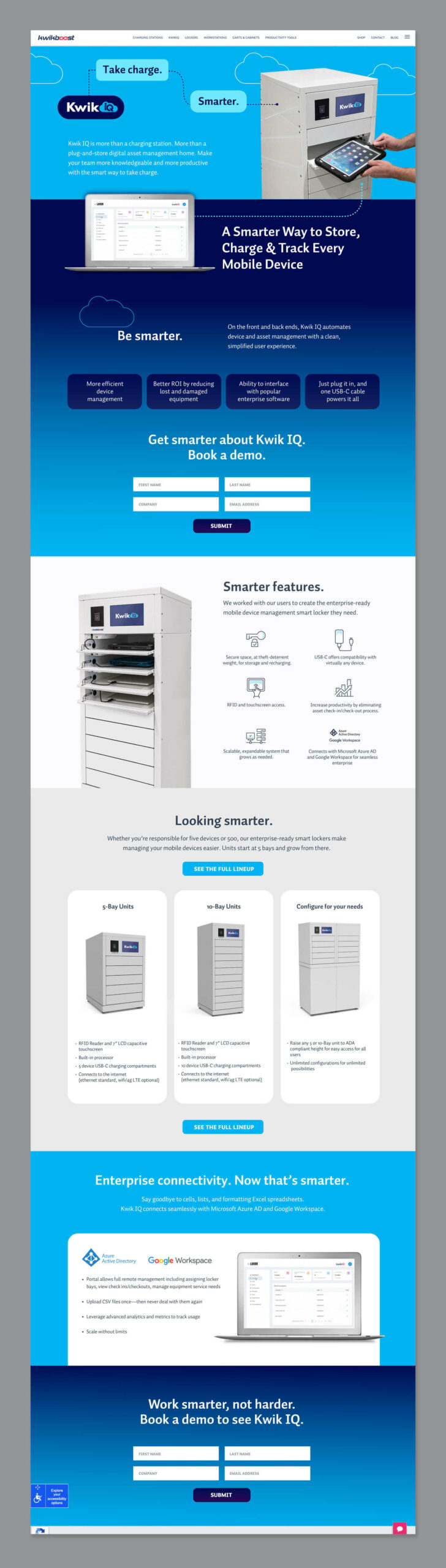
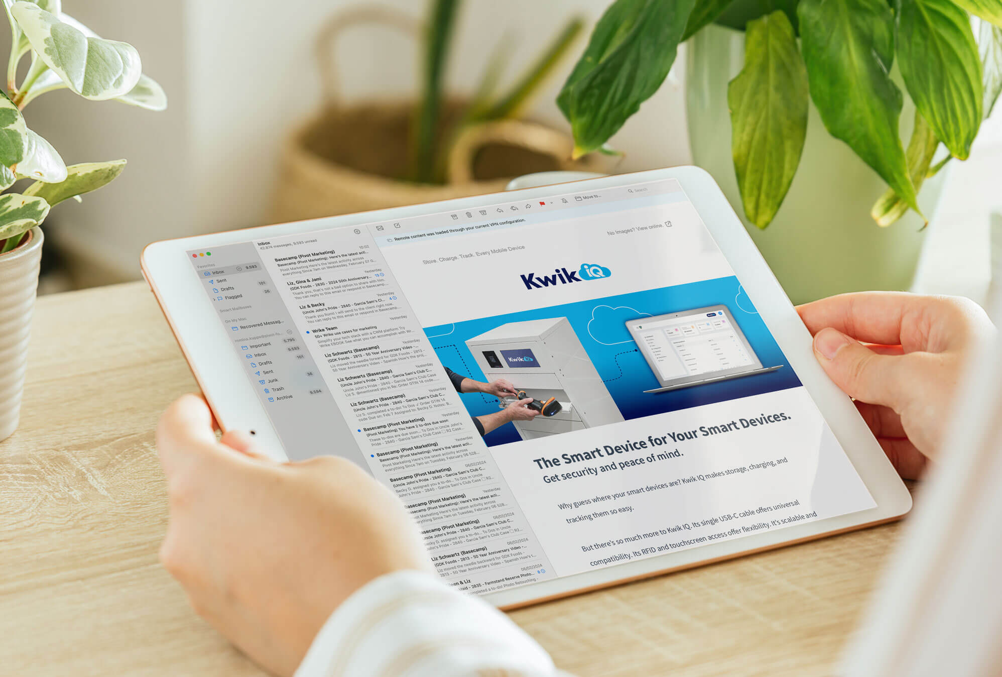
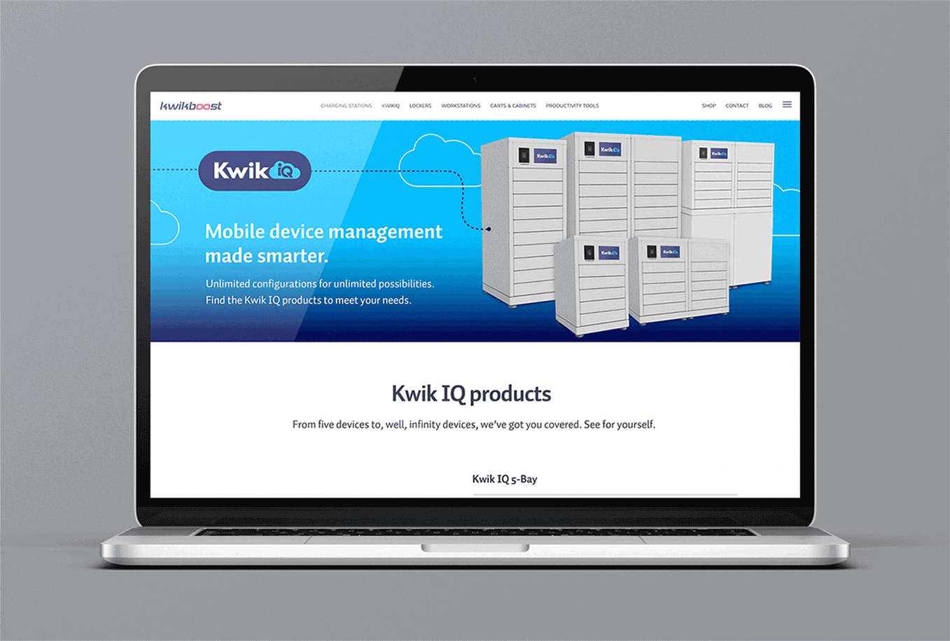
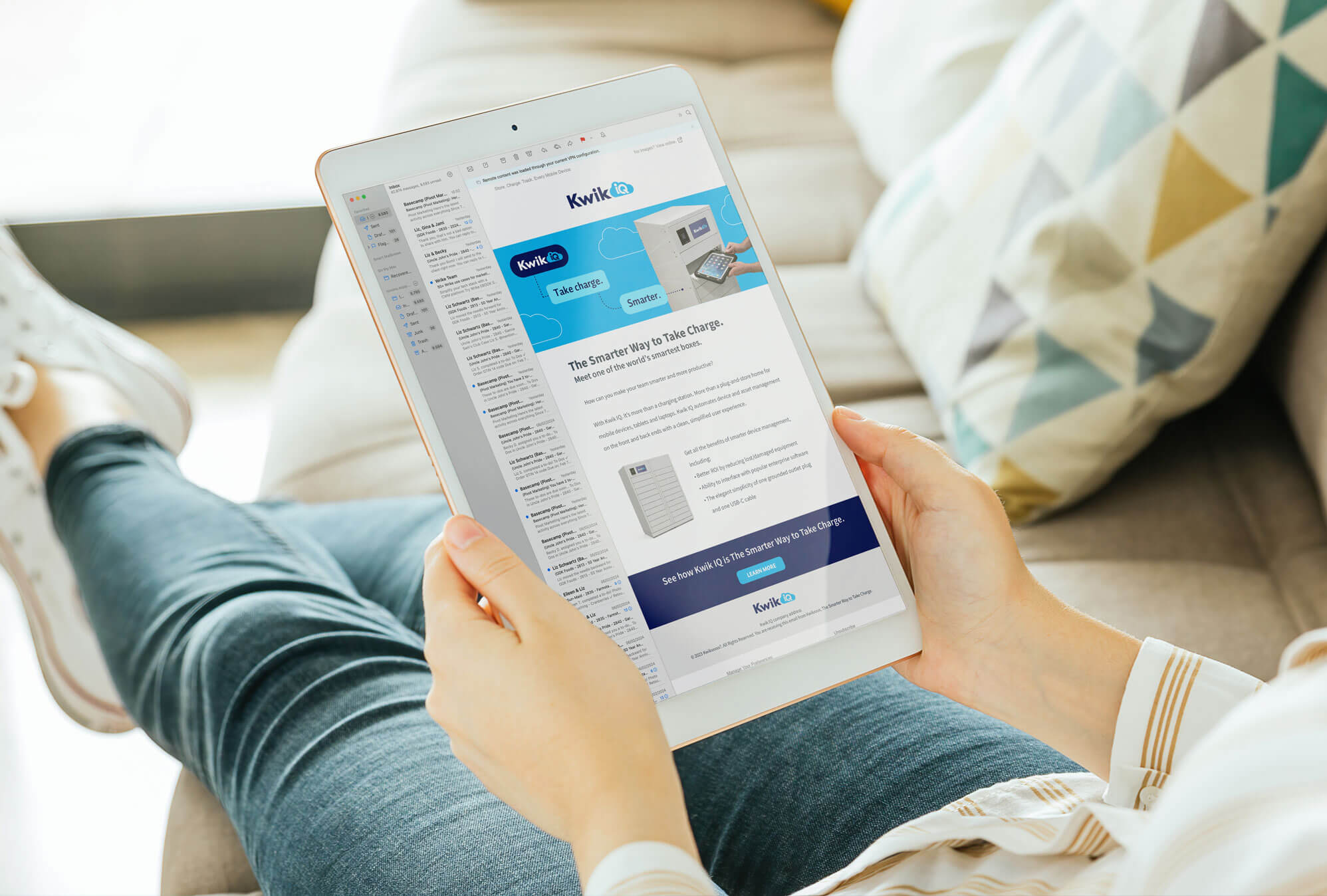
We also developed new language—using the active voice—for the product proposition and in how users and products interact with each other. And we brought all of it together on a new landing page, and in sell sheets and emails that make it easier for consumers to understand, and the sales team to sell, Kwik IQ products. And that’s the name of the game.
Category
Branding, Digital