Faultless Ironing Sprays
We ironed out the perfect packaging design system.Faultless Ironing Sprays
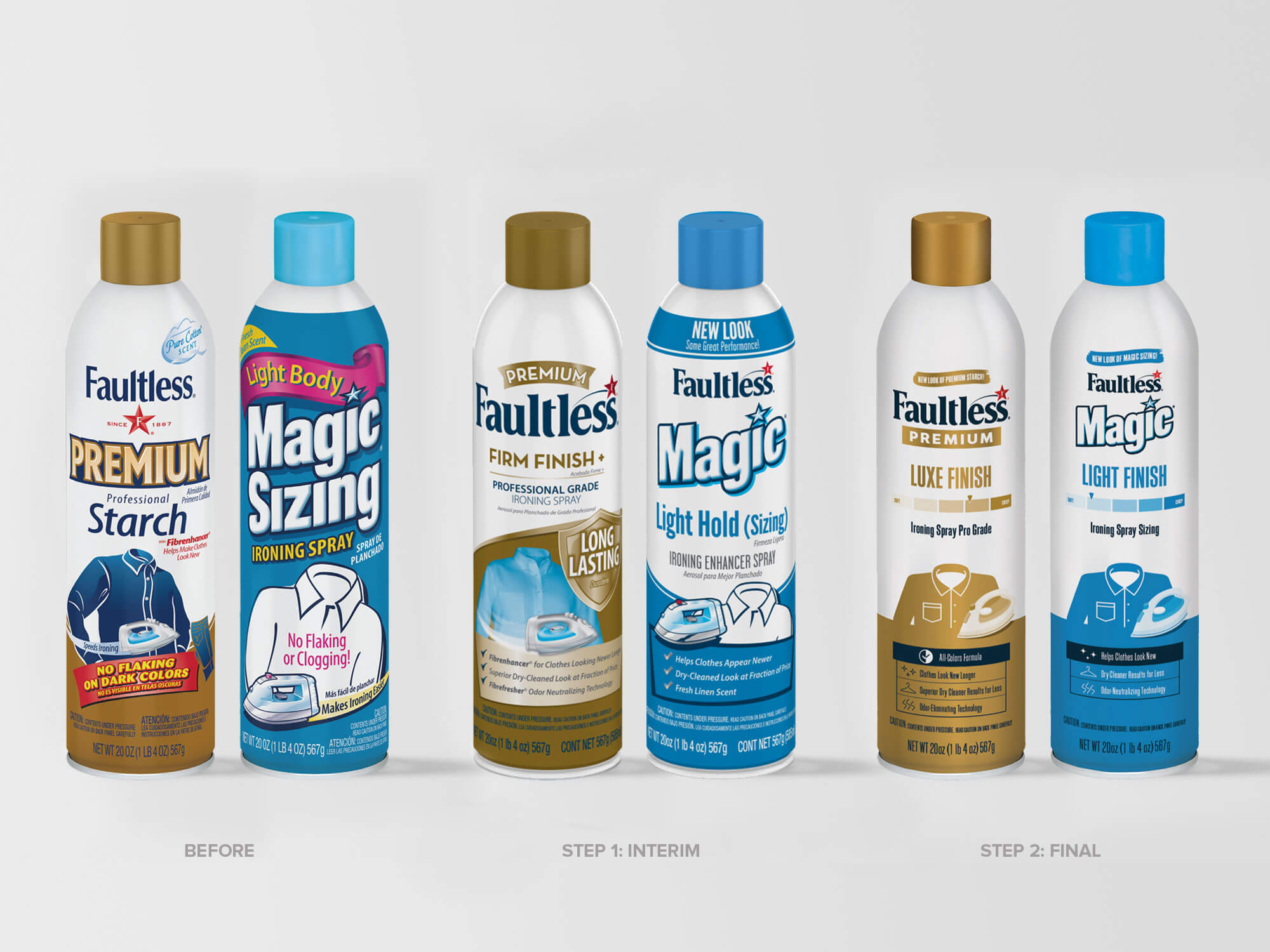
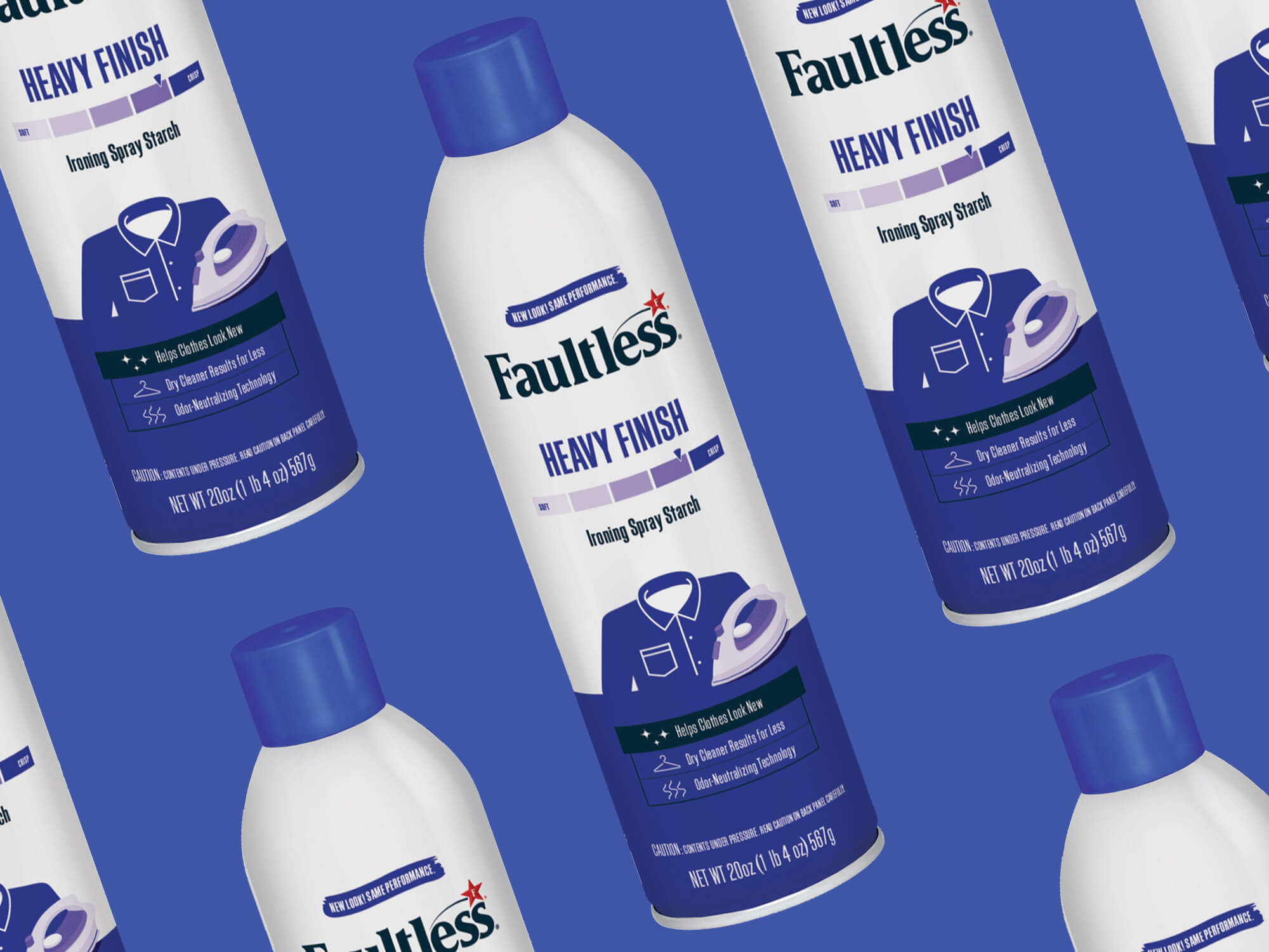
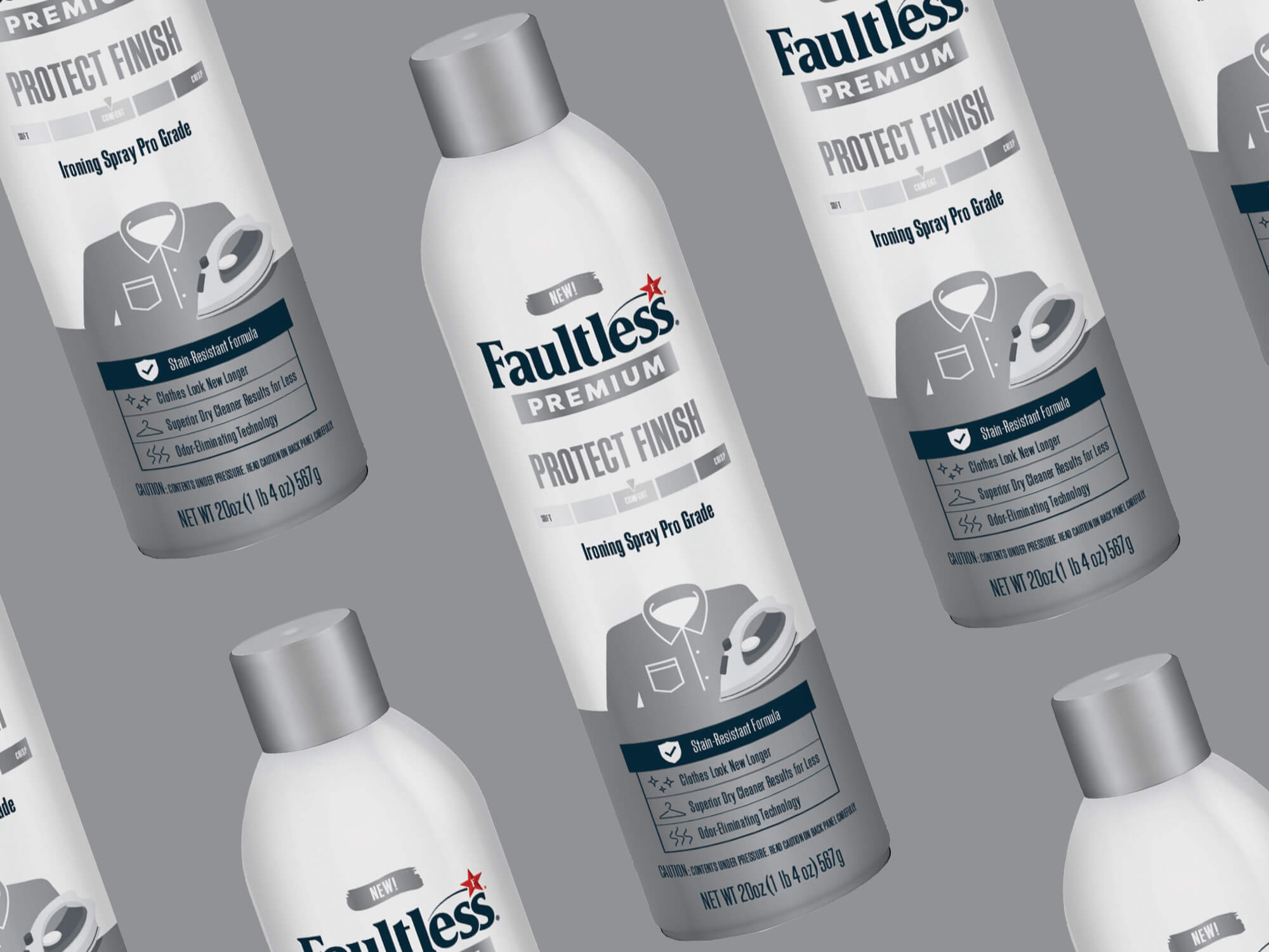
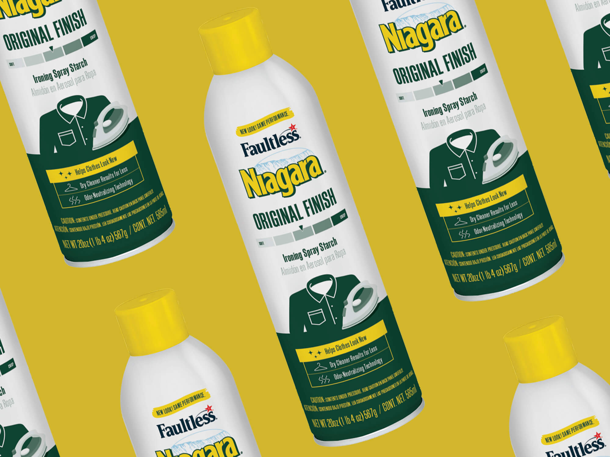
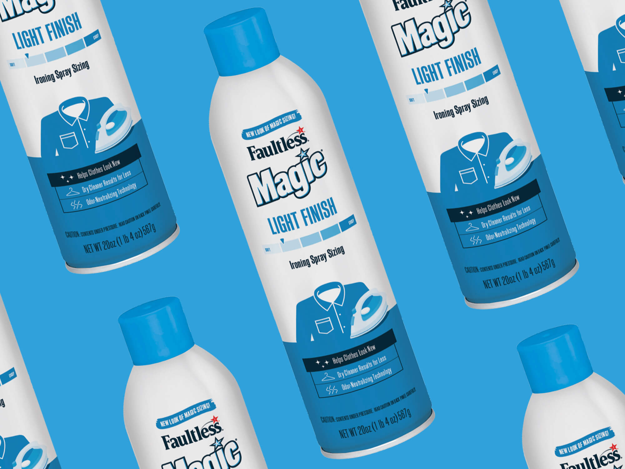
Sometimes, you need to make a change. But when you’re a 132-year-old international brand, change can be daunting and potentially confusing for long time consumers. We worked with the team at Faultless to develop a two-step packaging design change to help them reduce SKUs and realign under one Faultless umbrella, while maintaining key equity elements for consumers across the globe.
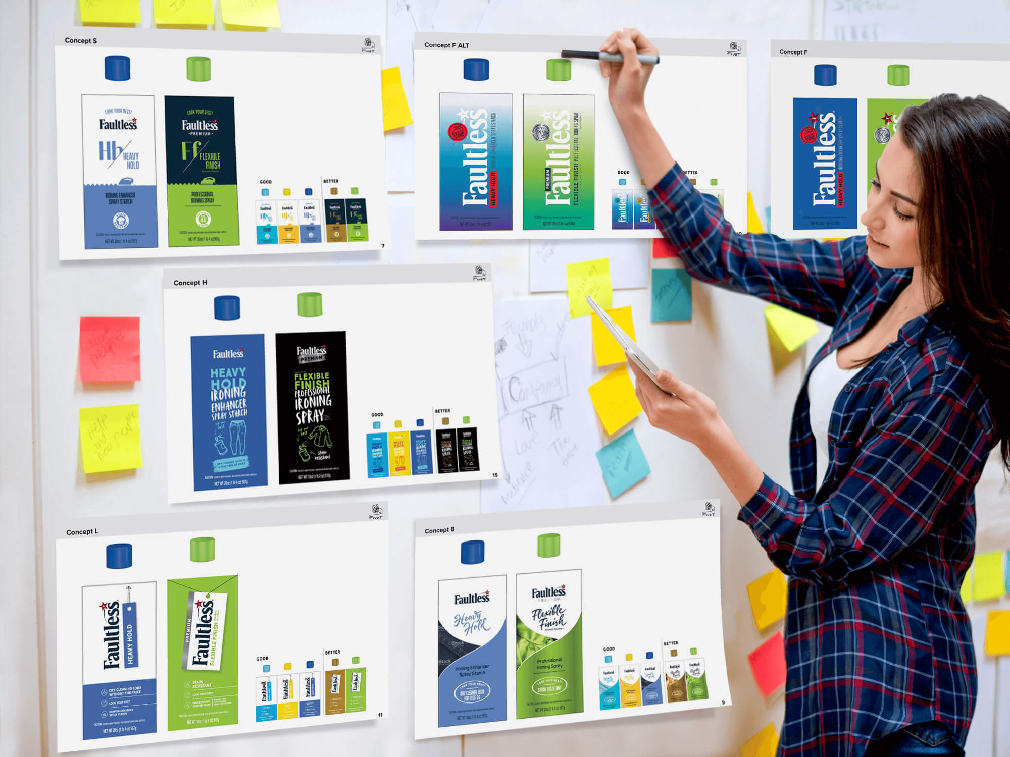
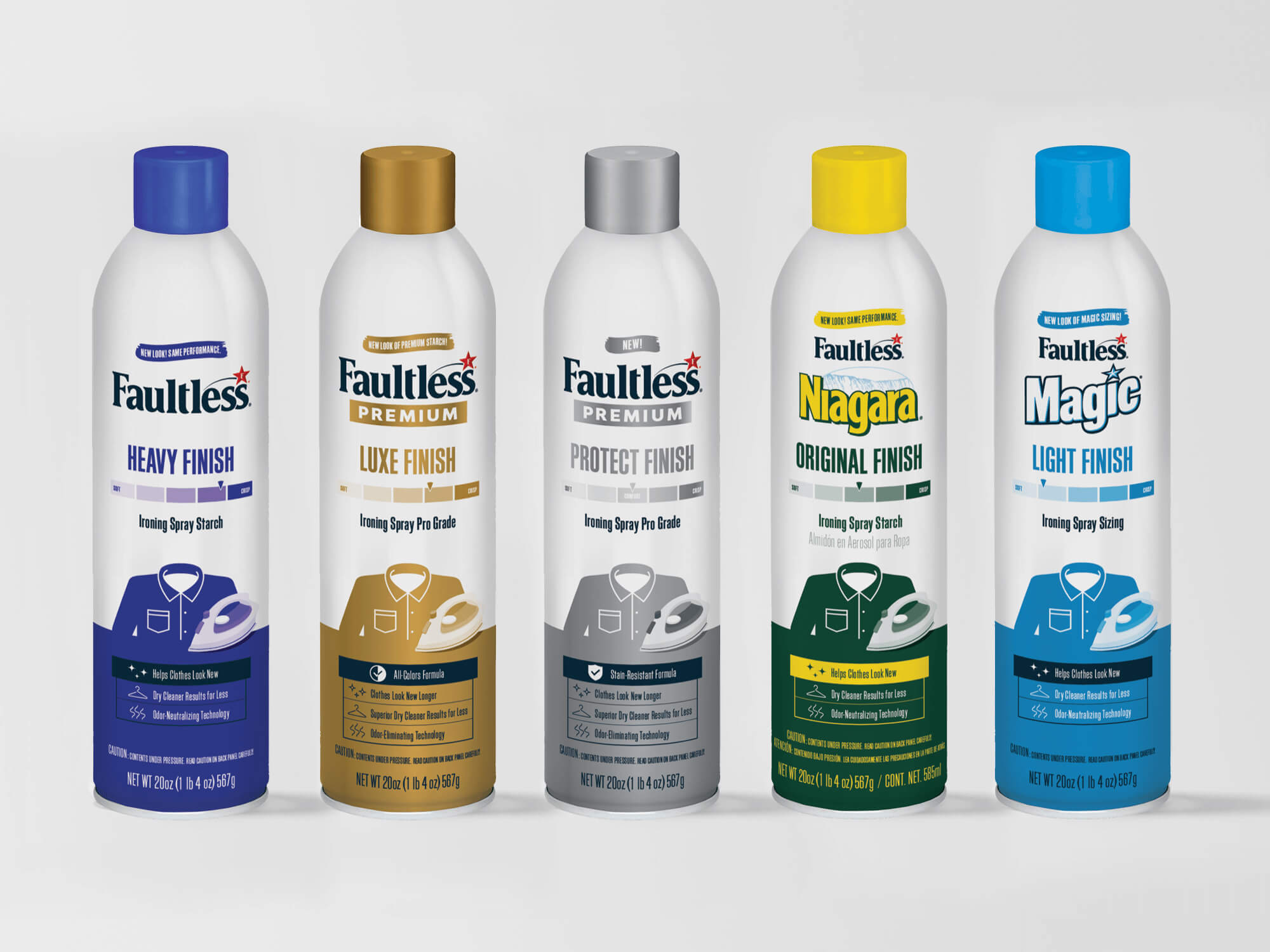
With insights in hand, we developed a new design system for Faultless that could visually communicate the strength of the product, differentiate premium offerings, and integrate brands like Niagara and Magic into the Faultless portfolio. Consumers told us how far we could, or could not, push the design and language while maintaining the equity of the product they loved. As this design system gets extended into international markets across the globe, this classic brand is now setup for success.
Category
Branding, Packaging

