Popcorn Thins
We made sales, well, pop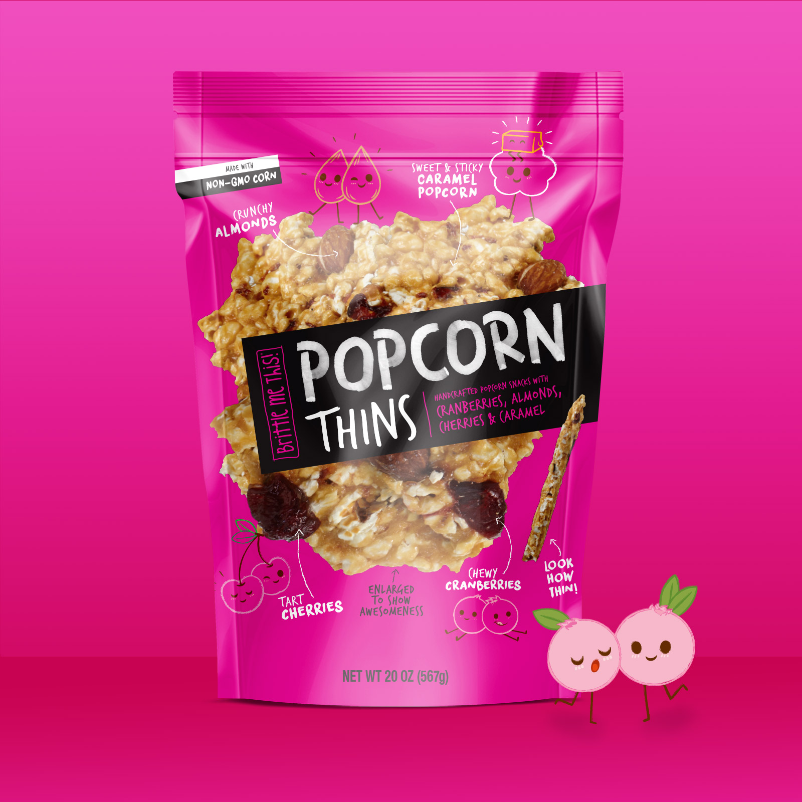
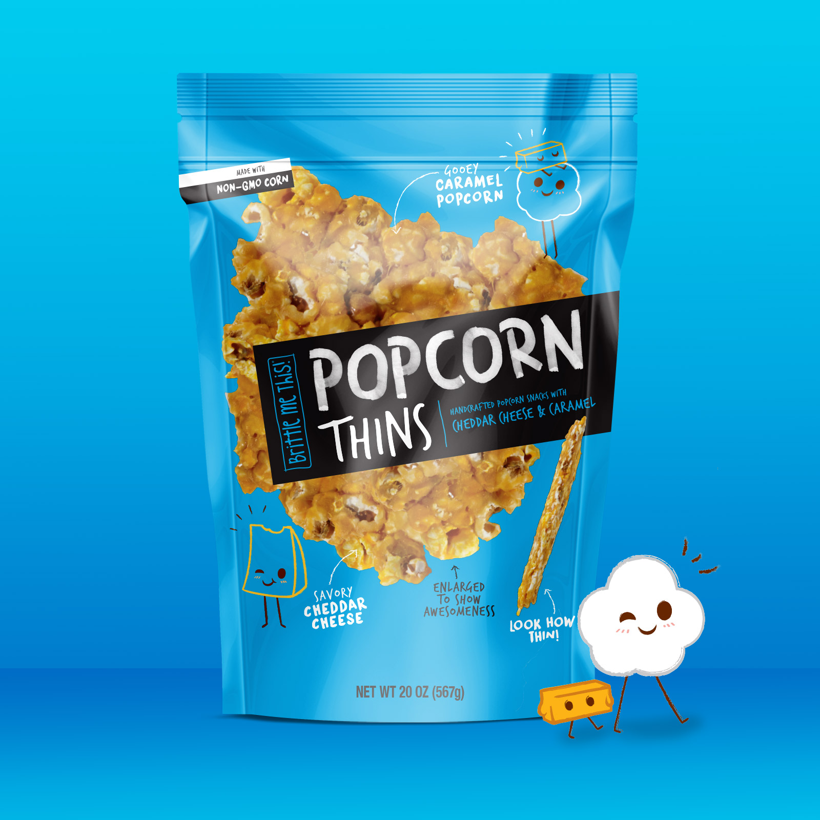
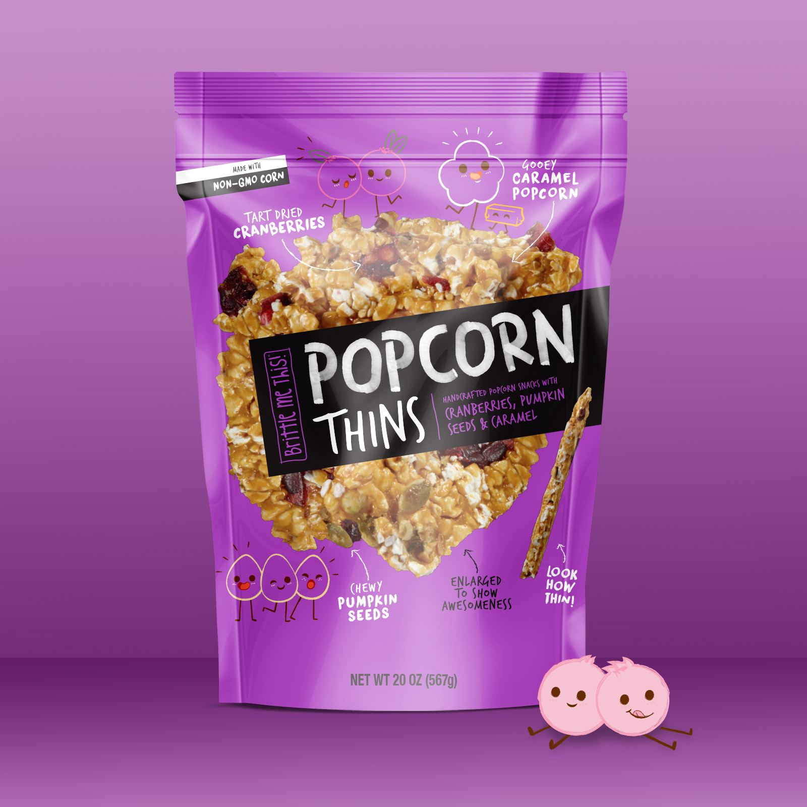
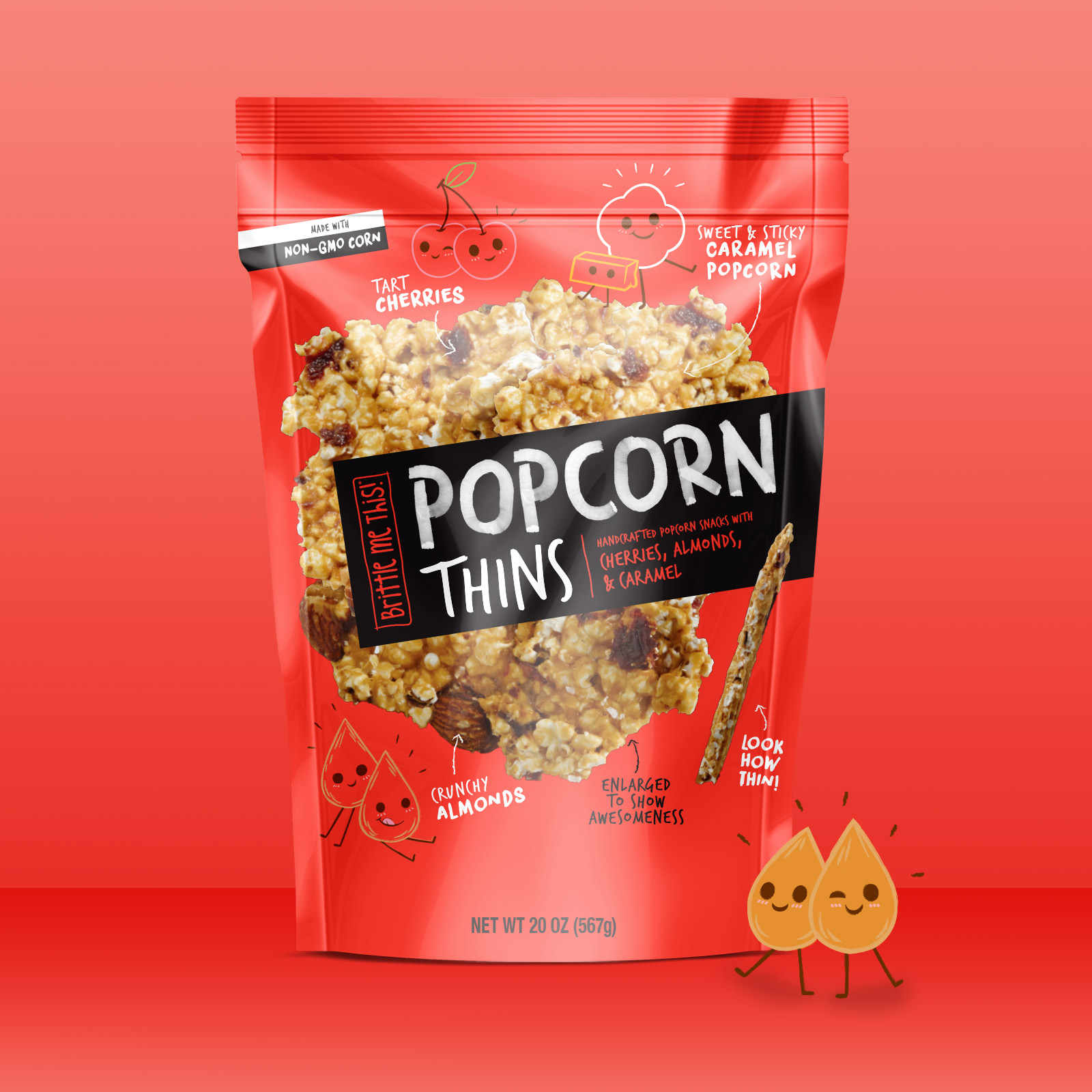
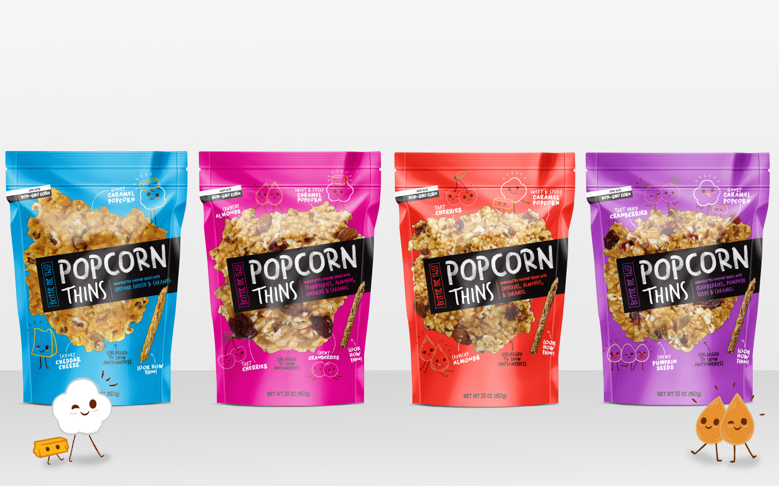
Popcorn Thins
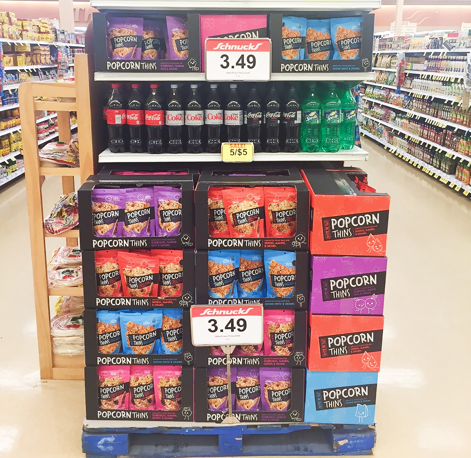
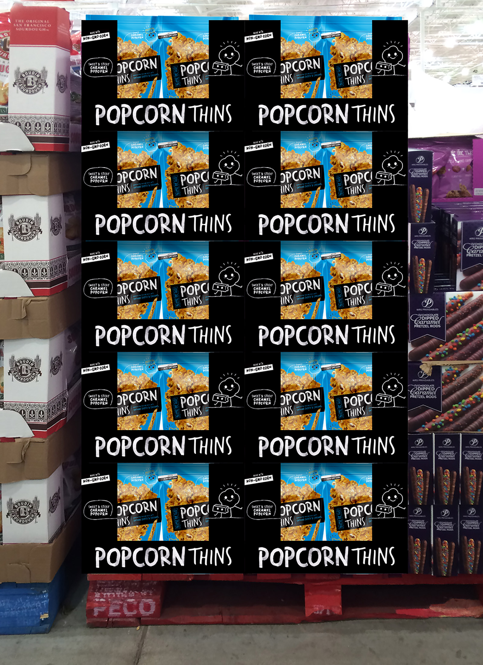
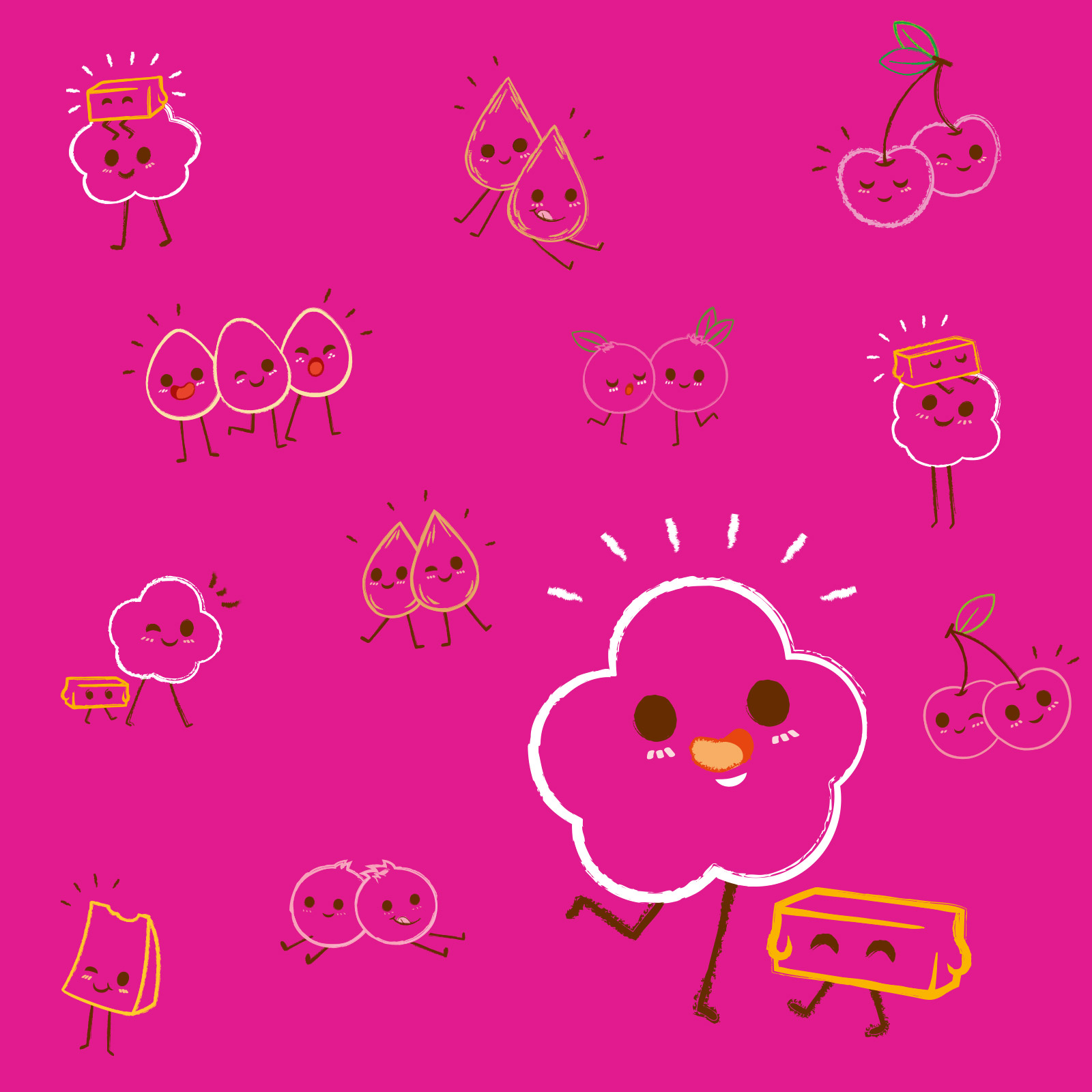
What happens when you have a great product, but the packaging is confusing and the name more so? Sales suffer. That’s exactly what was happening when our client reached out to us for a timely refresh. The Brittle Me This brand was causing a bit of confusion on shelf because the product—a pressed, sticky caramel and popcorn-based treat—wasn’t exactly brittle. What’s more, the packaging didn’t make it clear that the product was a guilt-free, healthy and delicious snack. So, we went back to the drawing board, reimagining what the product could be, and refocused the offering. Renaming it Popcorn Thins drew an immediate connotation with consumers, and the whimsical packaging redesign underscored the fun element of snacking. We also provided merchandising solutions in club and retail stores and even illustrated characters used on bag.
Client:
Category
Branding, Packaging