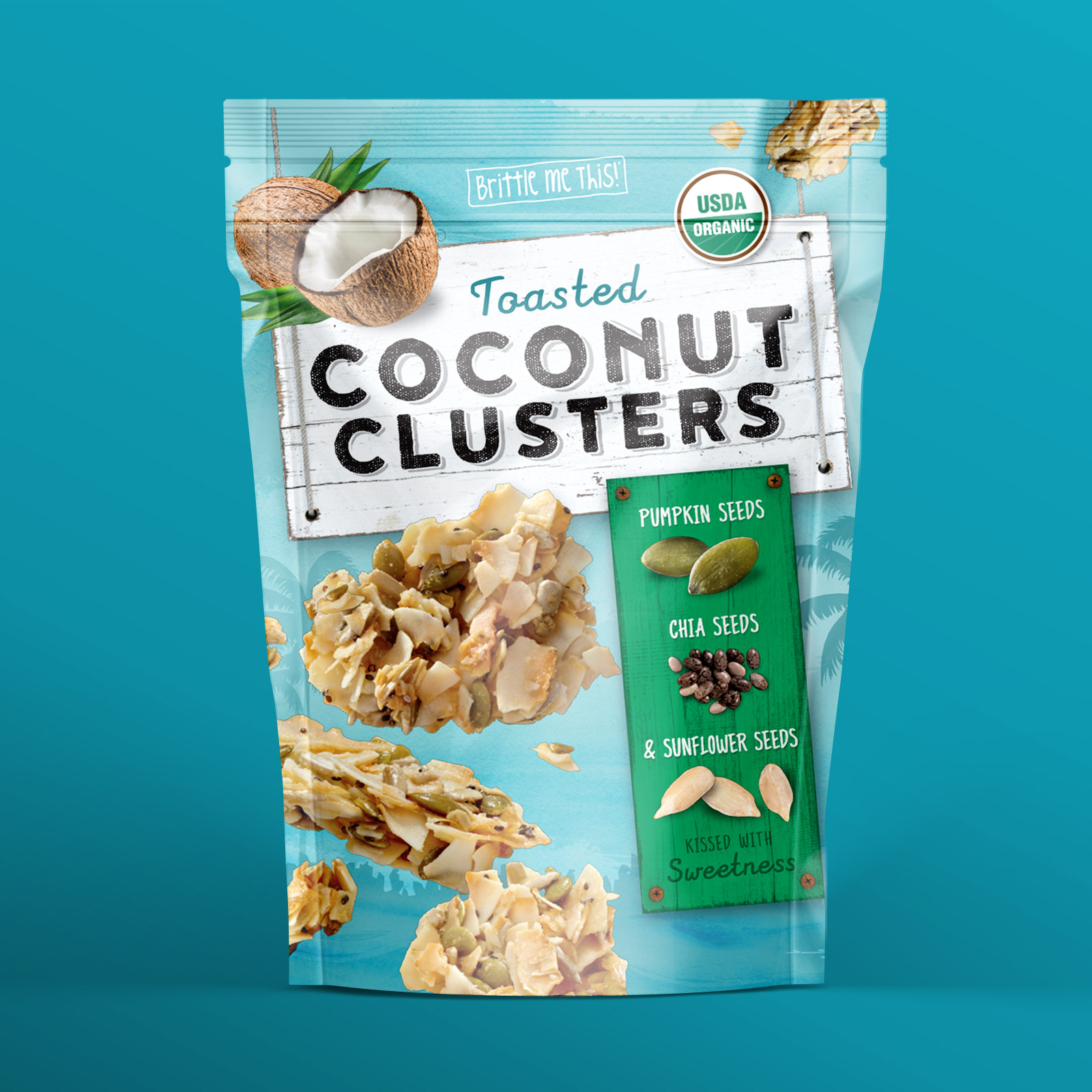
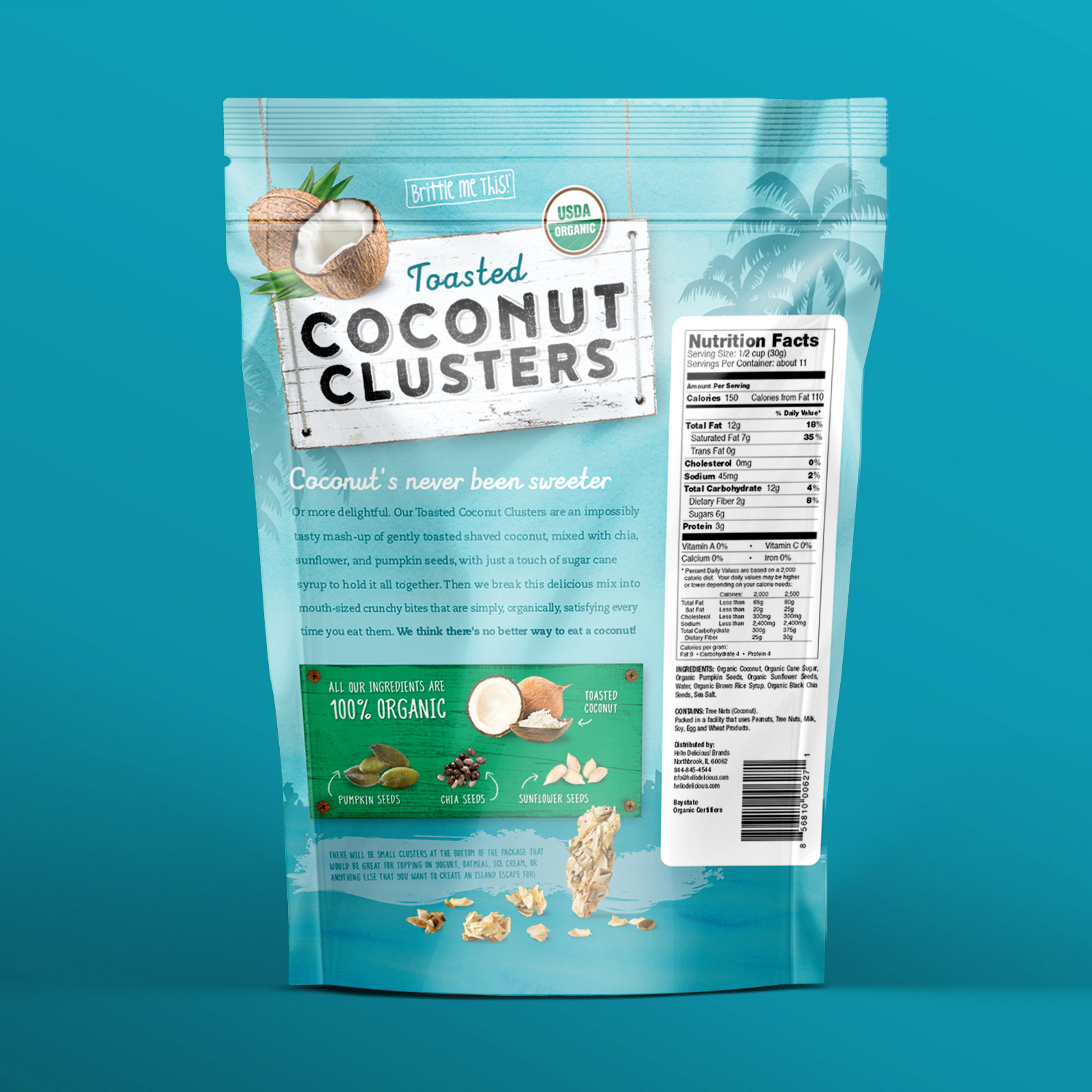
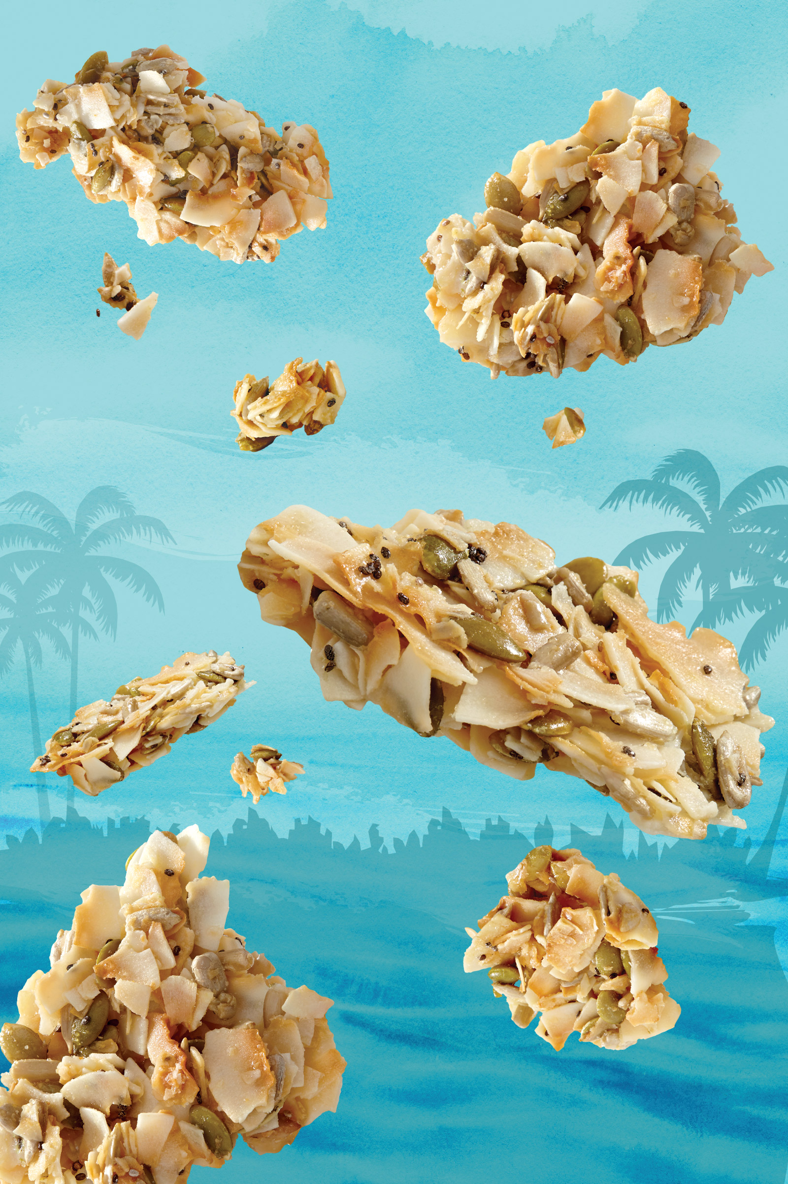
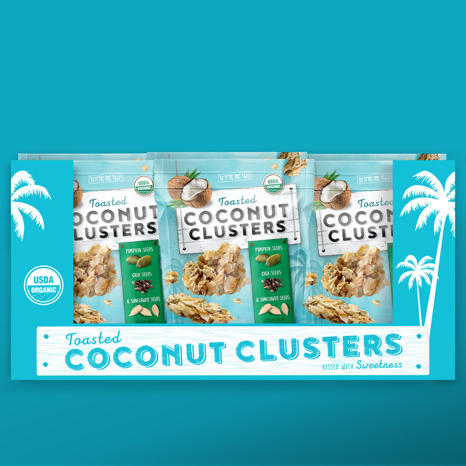
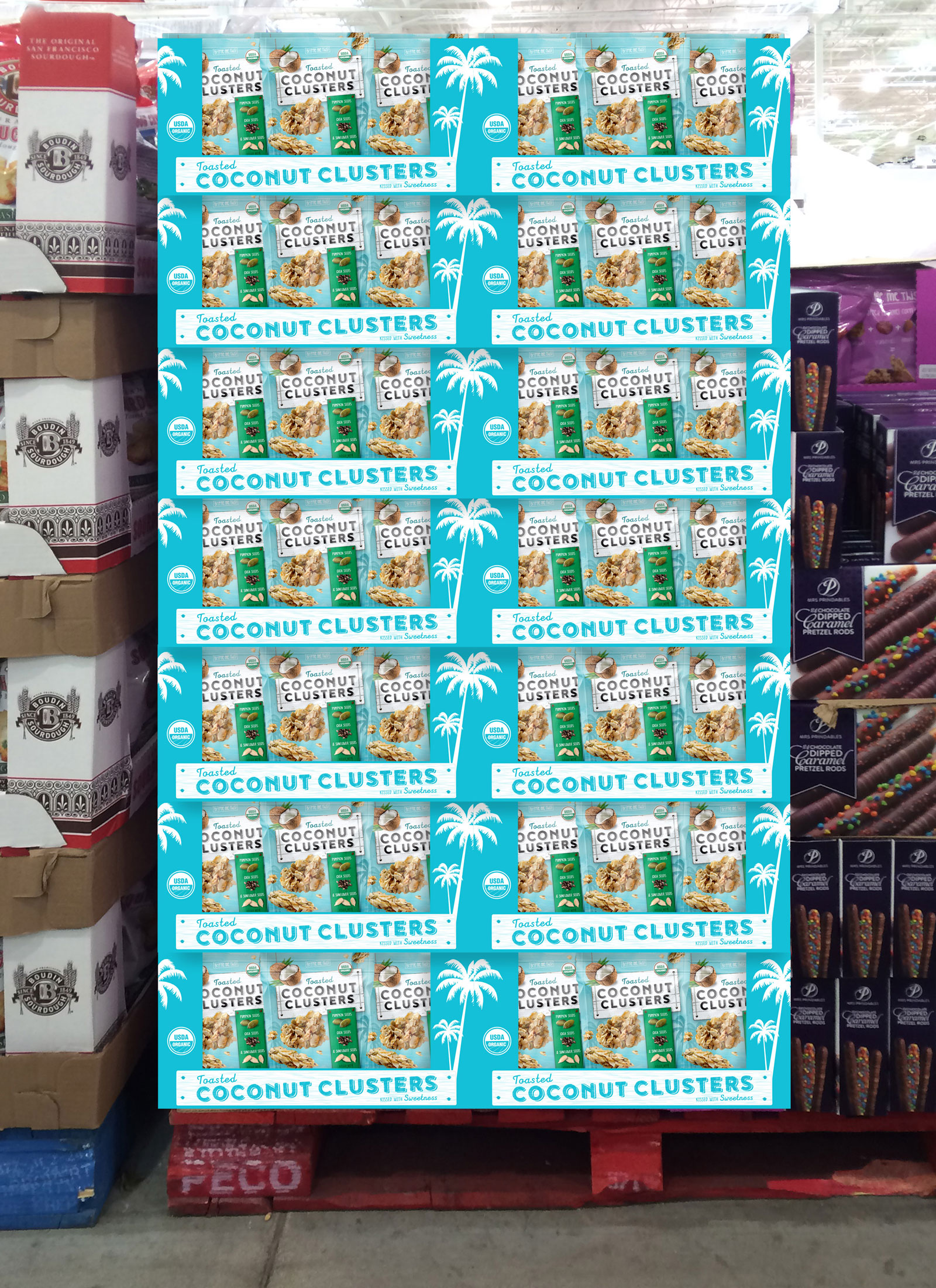
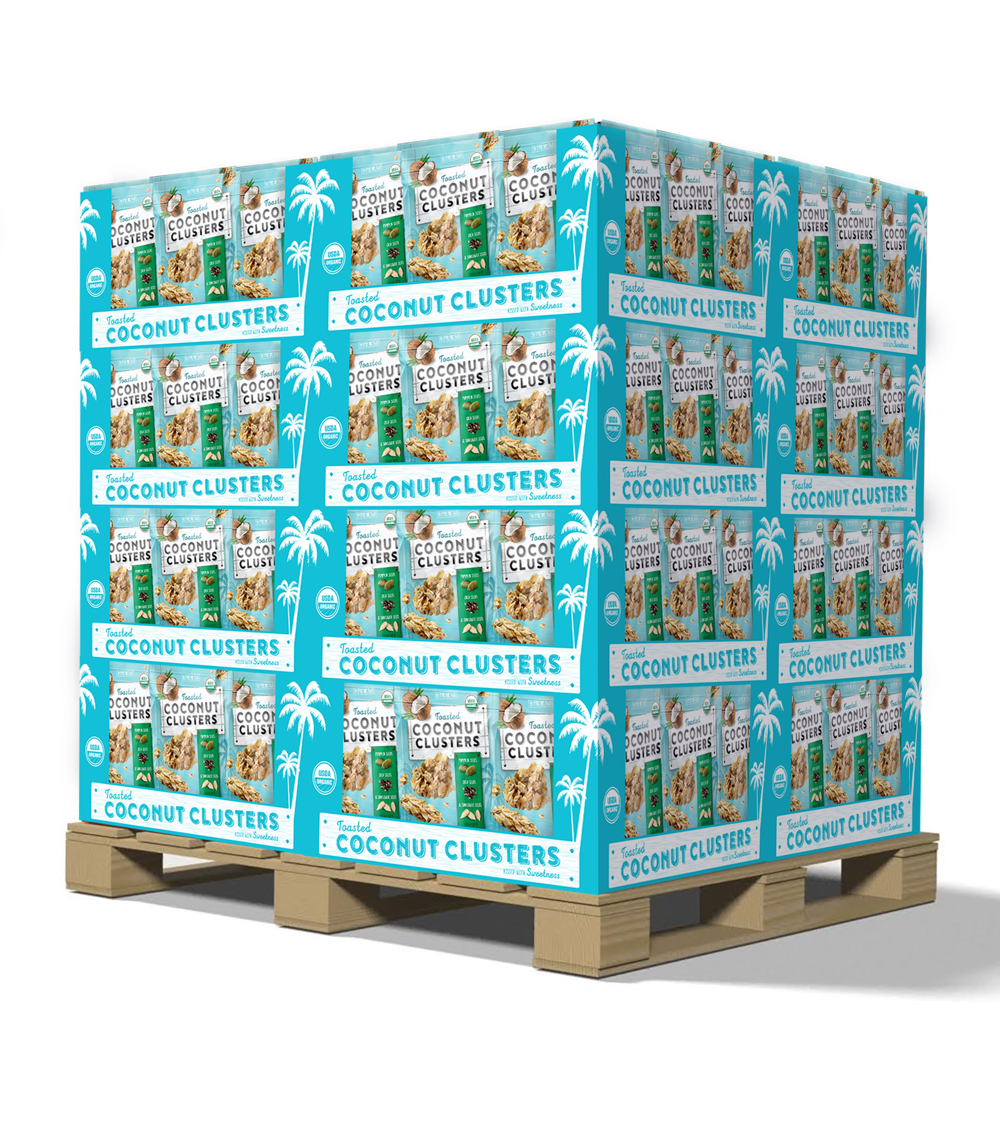
Toasted coconut mixed with chia, pumpkin and sunflower seeds is not your typical snack. So why design a typical package? Instead, we got to the essence of Toasted Coconut Clusters, looking at not only visuals, but the overall form factor of the product for inspiration. Our take: the product was uncommon, so the design approach should be too, in order to resonate with potential audiences. That meant focusing on color palettes that evoked a sense of place—cool hues and funky, laid-back typefaces with a touch of the tropics in design. And that also meant designing a package that was unlike the typical aggressive, in-your-face riot of colors and type typical to snack foods.

