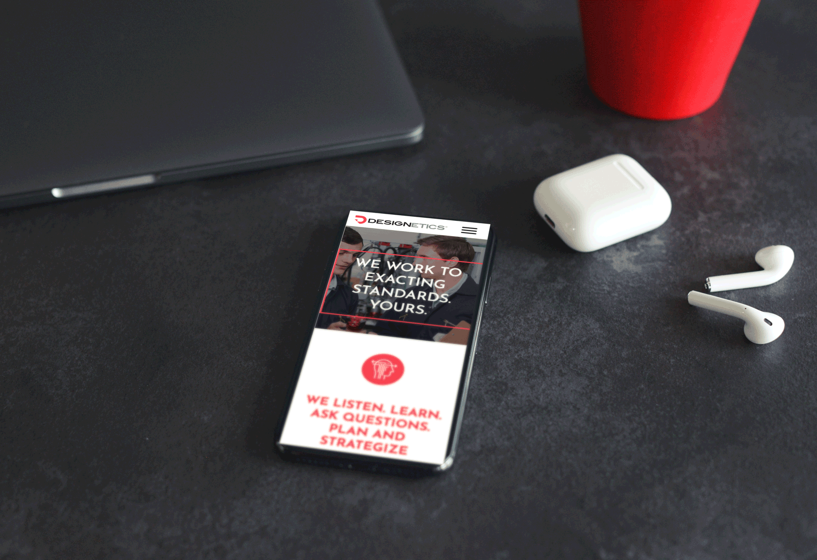
Designetics Web
We made the content flow.Designetics Web
Designetics is the acknowledged leader in fluid application systems and solutions. Problem was, the potential threat of Intellectual Property theft from would-be competitors made the company create a web presence that was downright mysterious. In fact, the worry of giving away too many corporate secrets made for oblique website content and a lackluster presentation of capabilities. In short, web visitors came away not knowing what Designetics did—and worse, not understanding that the company was the innovator in the field. Until we came along.
We first analyzed what was working content-wise, and what needed an overhaul, creating a new process flow of information. Mindful that users absorb content through three paths—sequentially, starting at the homepage; navigationally, getting to specific pages and bypassing content on the homepage; and via interactive or video-based elements—we constructed content that reinforced brand messaging and the “why to buy” on each page to ensure our communications were on target regardless of consumer pathing.
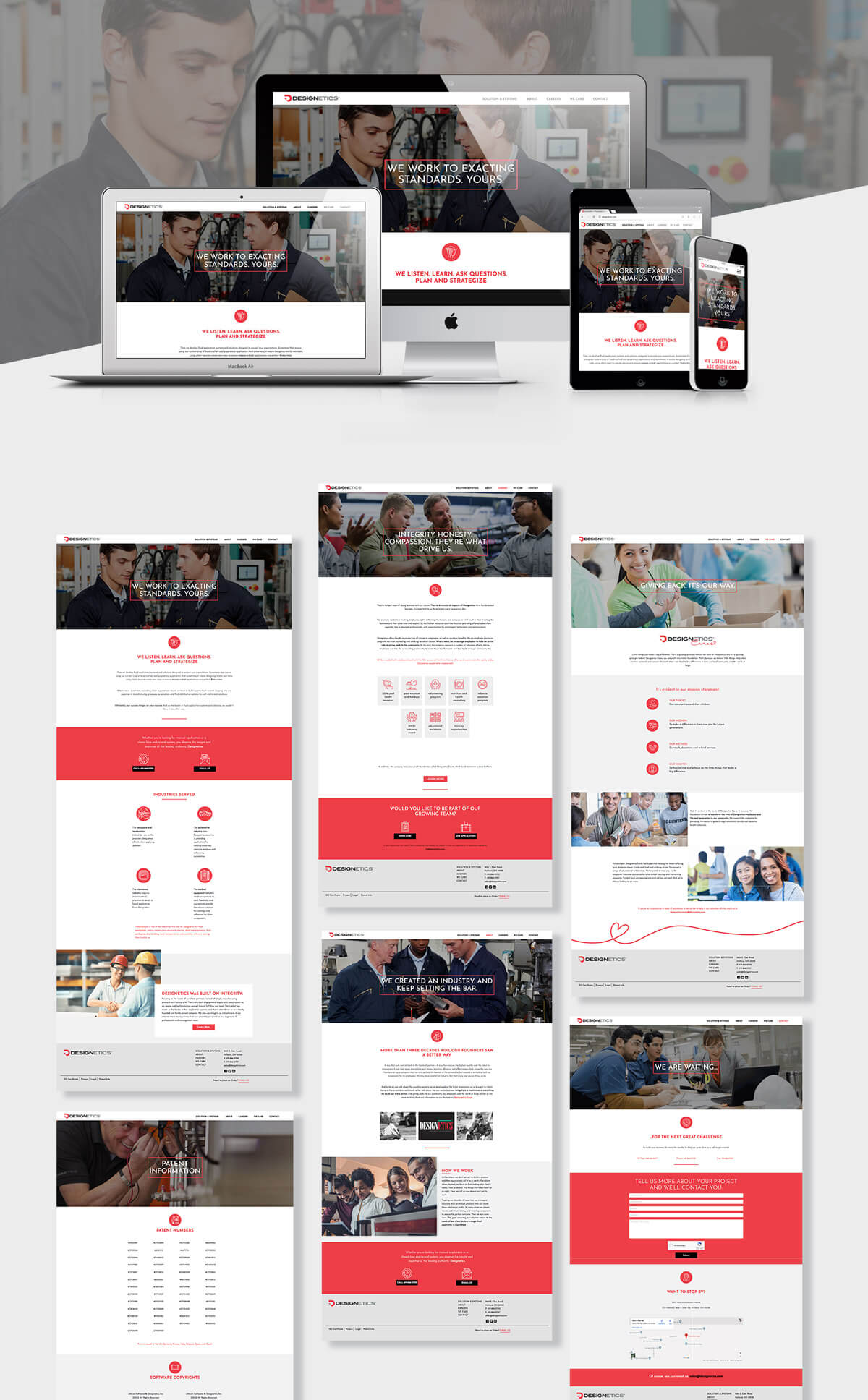
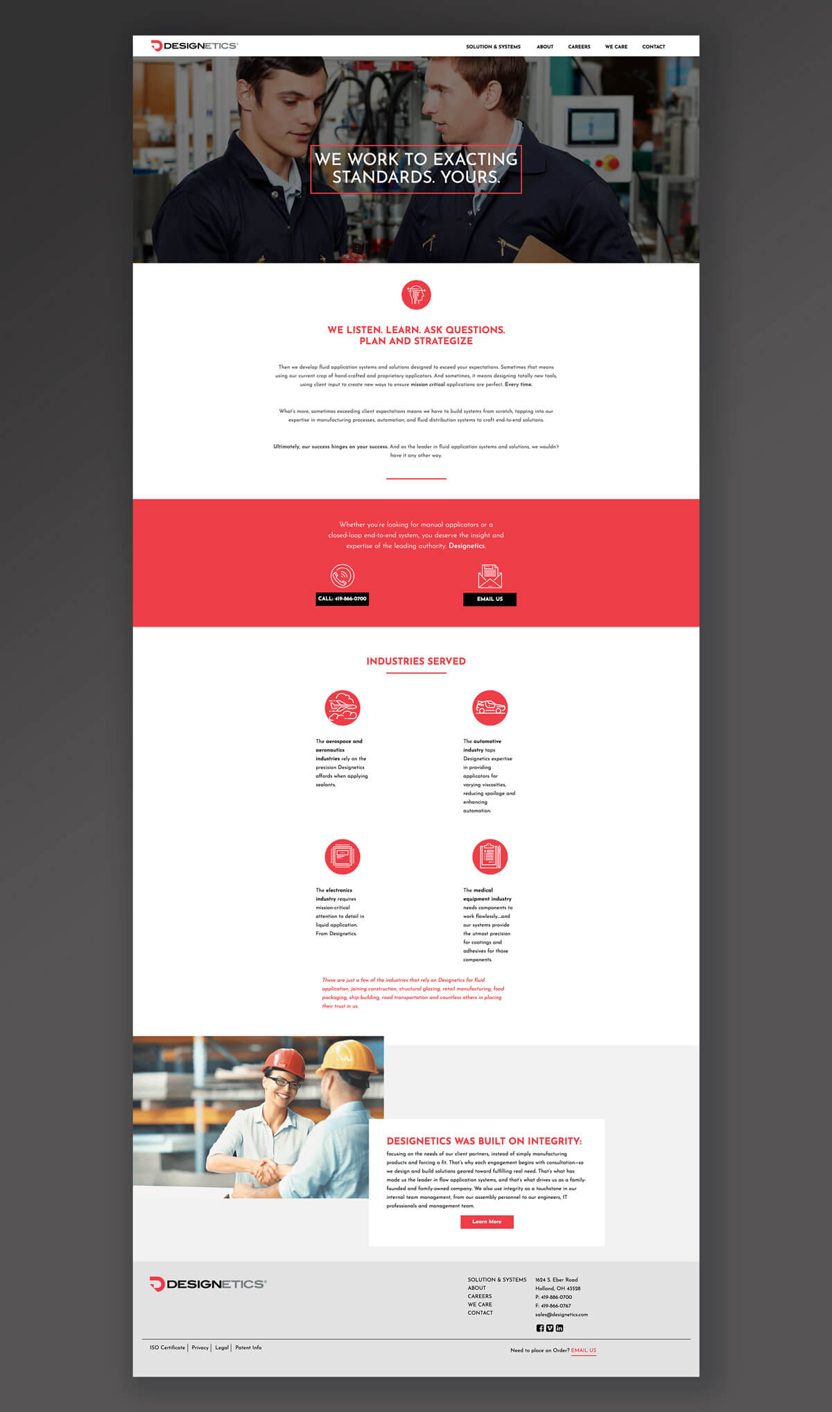
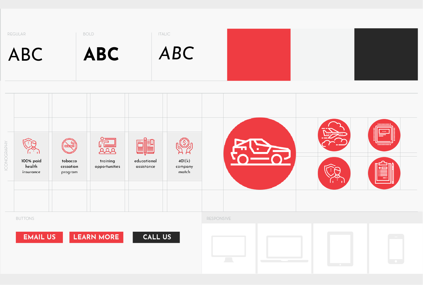
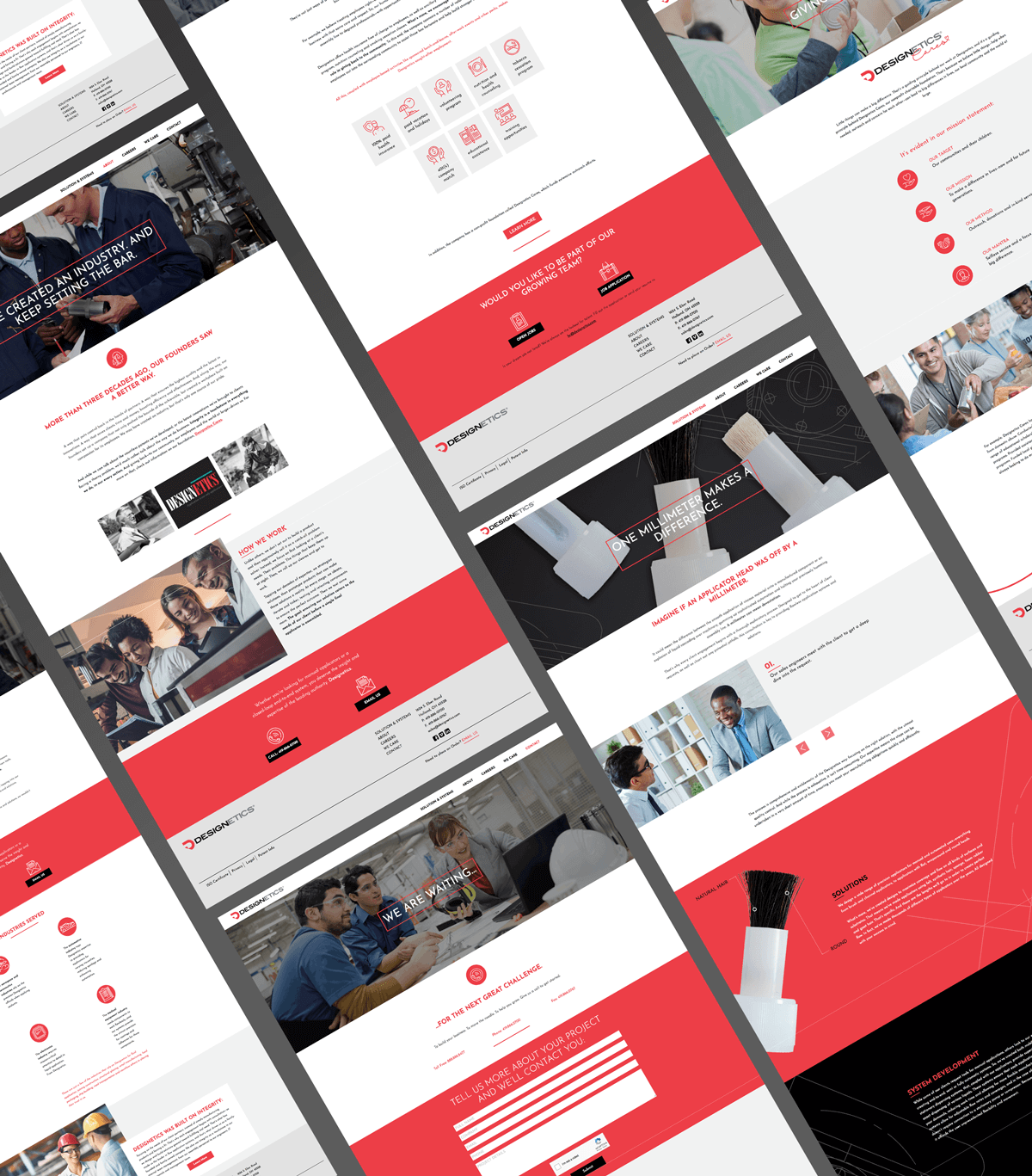
Then, we set about to rewrite the site, focusing on triggers to make users aware of Designetics’ points of difference and superiority. Soon, we found the tonality and amped up content didn’t match the previous cookie-cutter design and navigation…so, we overhauled that too, providing visual flair, dynamic punch, a progressive design and a more user-friendly experience. The result: a site worthy of the industry leader. Visit designetics.com
Category
Digital

