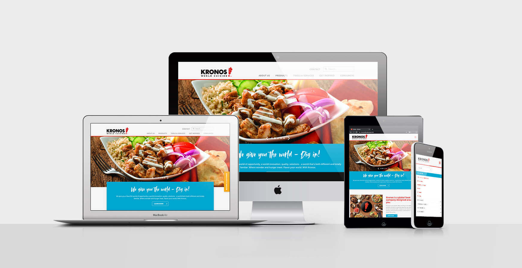
Kronos Website
Kronos Website
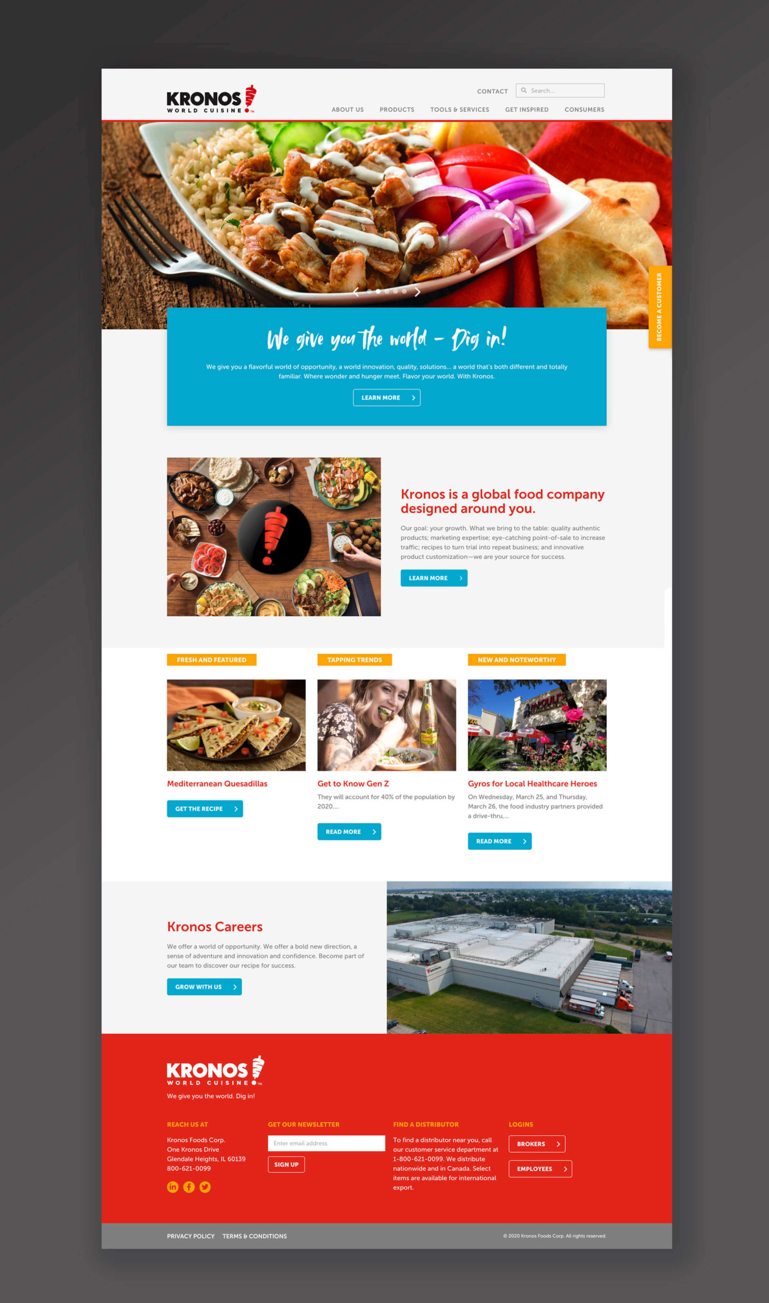
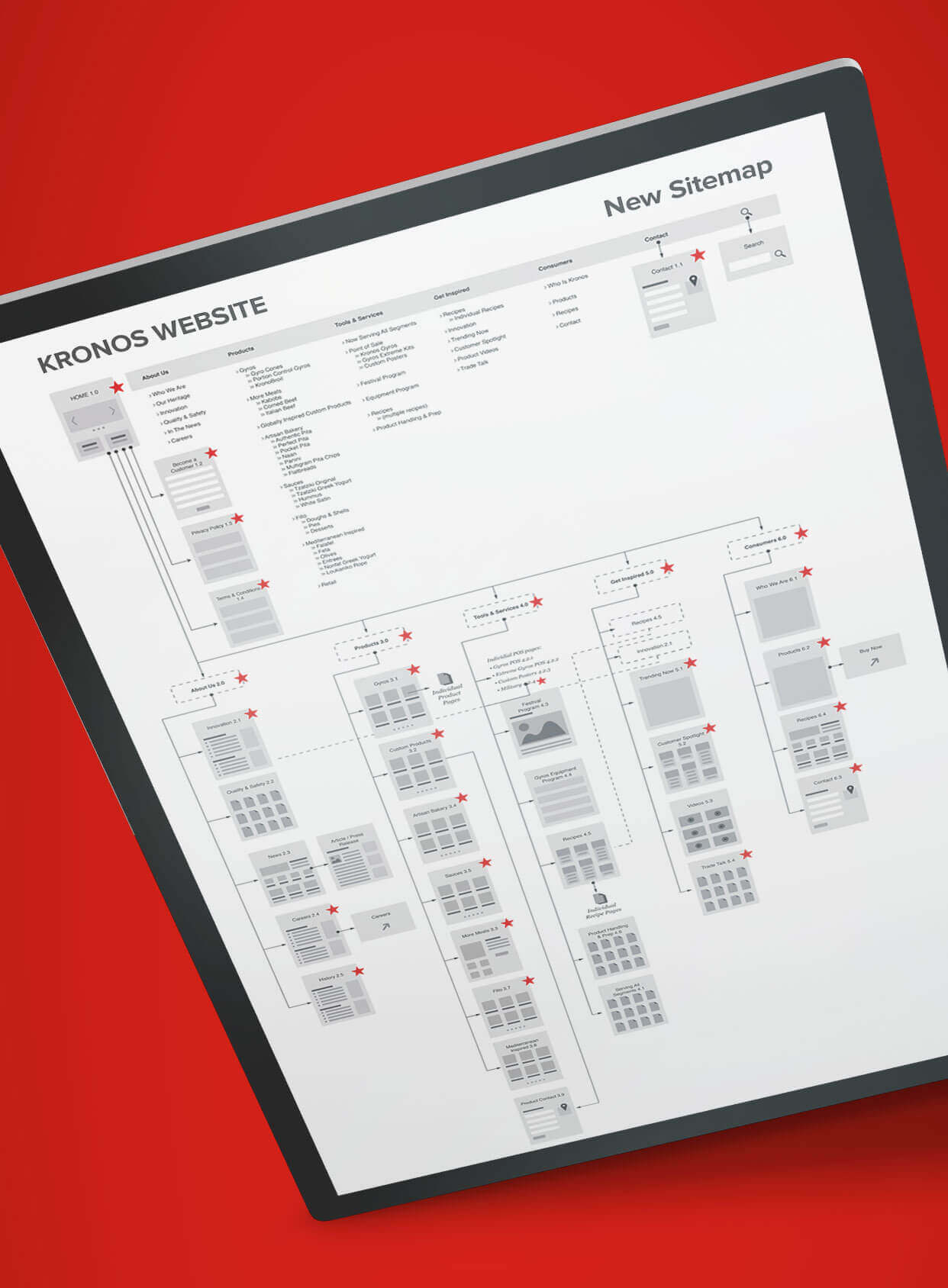
After a recent refresh of their brand, the team at Kronos looked at their website and realized a big change was in order. Not only was the visual off for the company Kronos had become, but the content had been added to for years and was no longer a fluid user experience. Navigation was tricky, content was out of date and most of all… for a food company it wasn’t very appetizing.
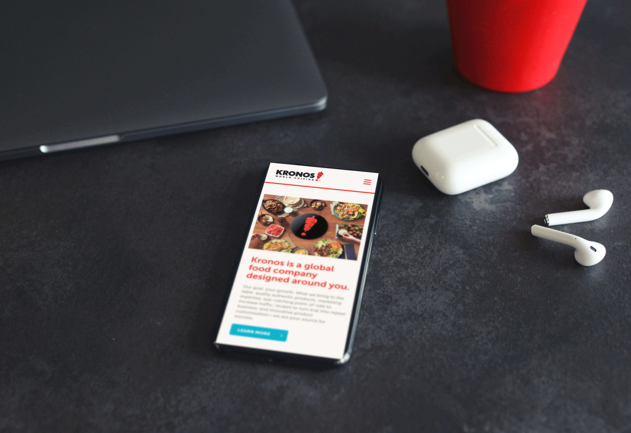
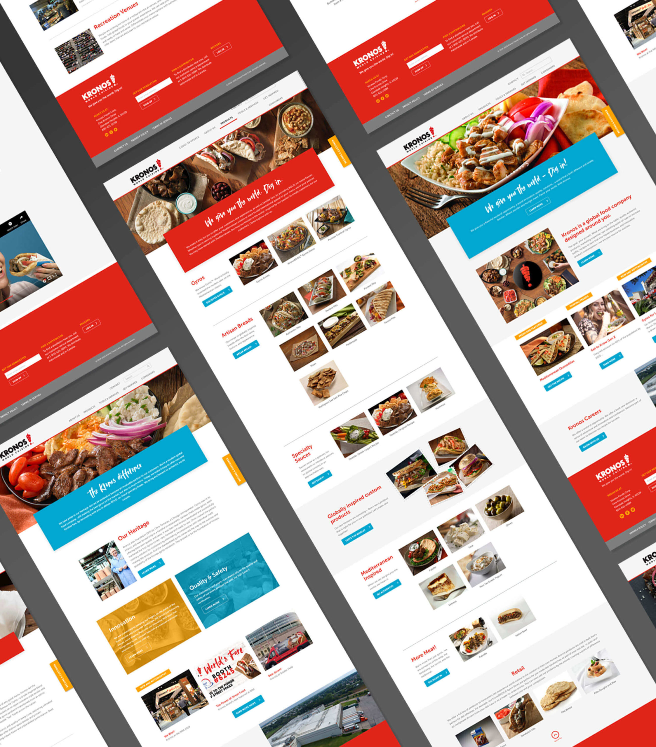
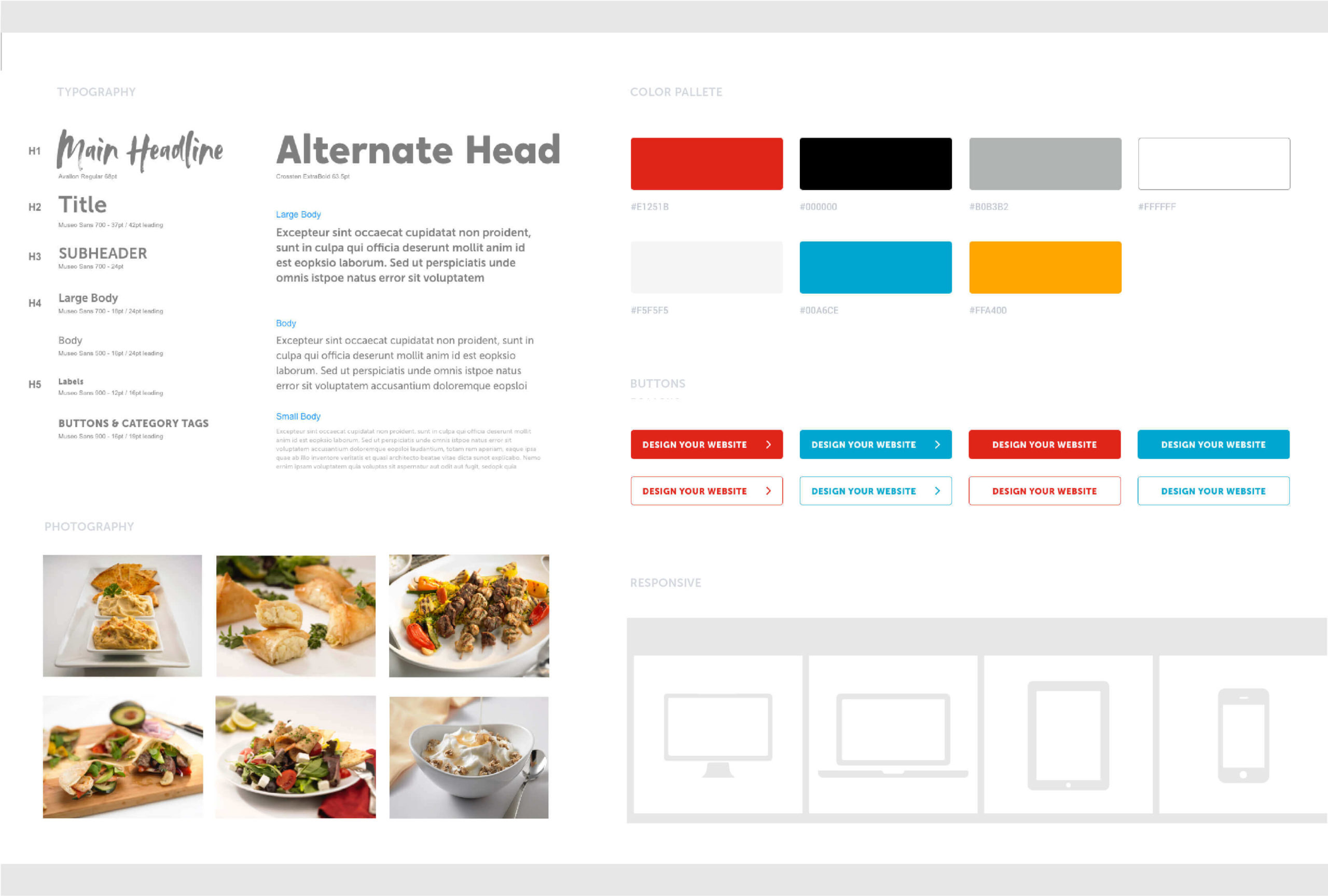
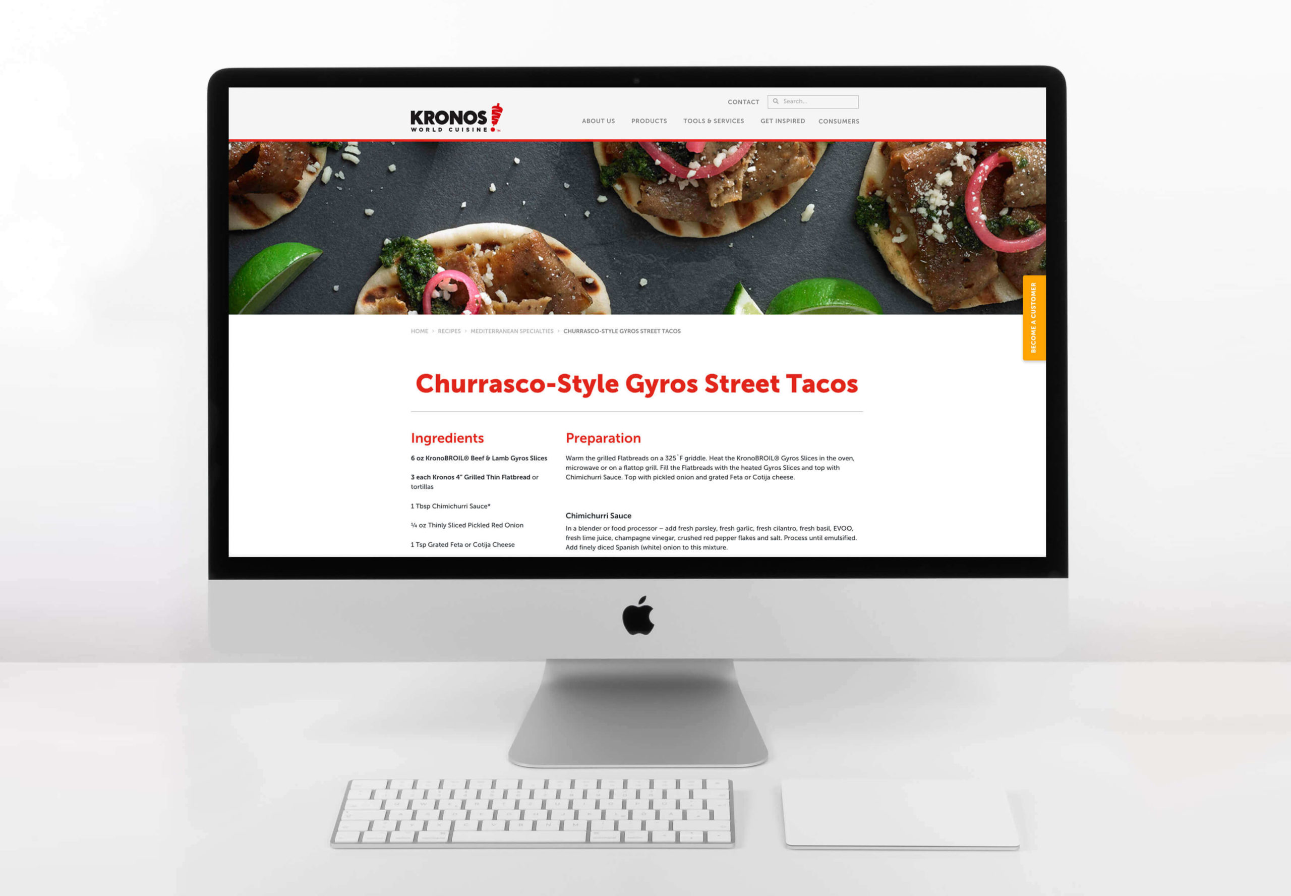
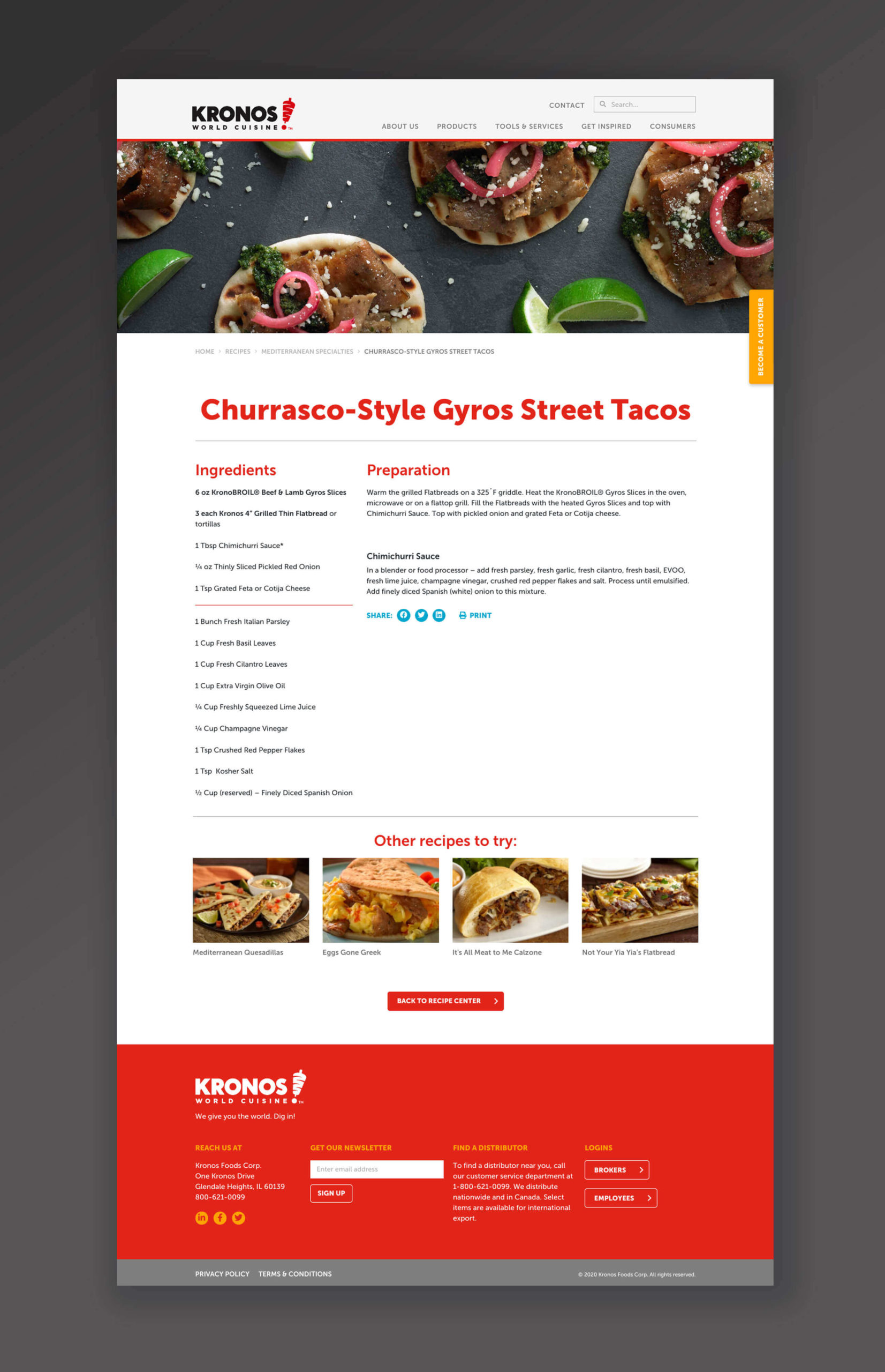
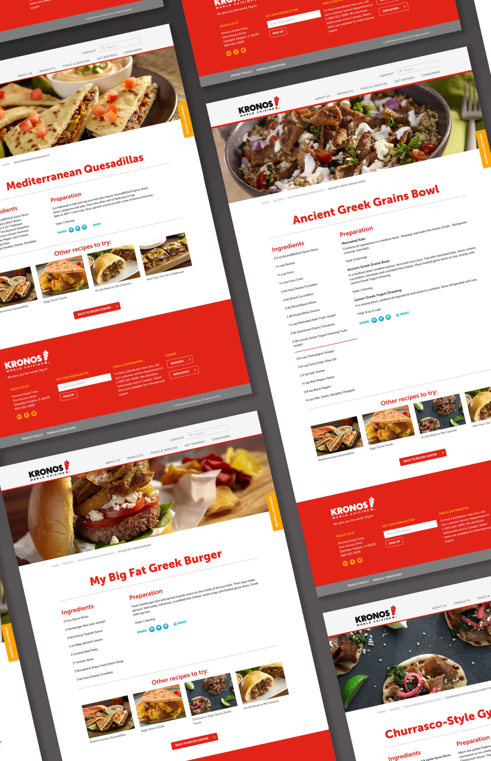
Pivot stepped in and helped hit the reset button… with a complete rework of the content, a refresh of the language, and a new visually yummy design. Putting the focus back on the food helped this Mediterranean powerhouse better communicate with the restaurant operators, consumers and all of their web users.
Category
Digital


