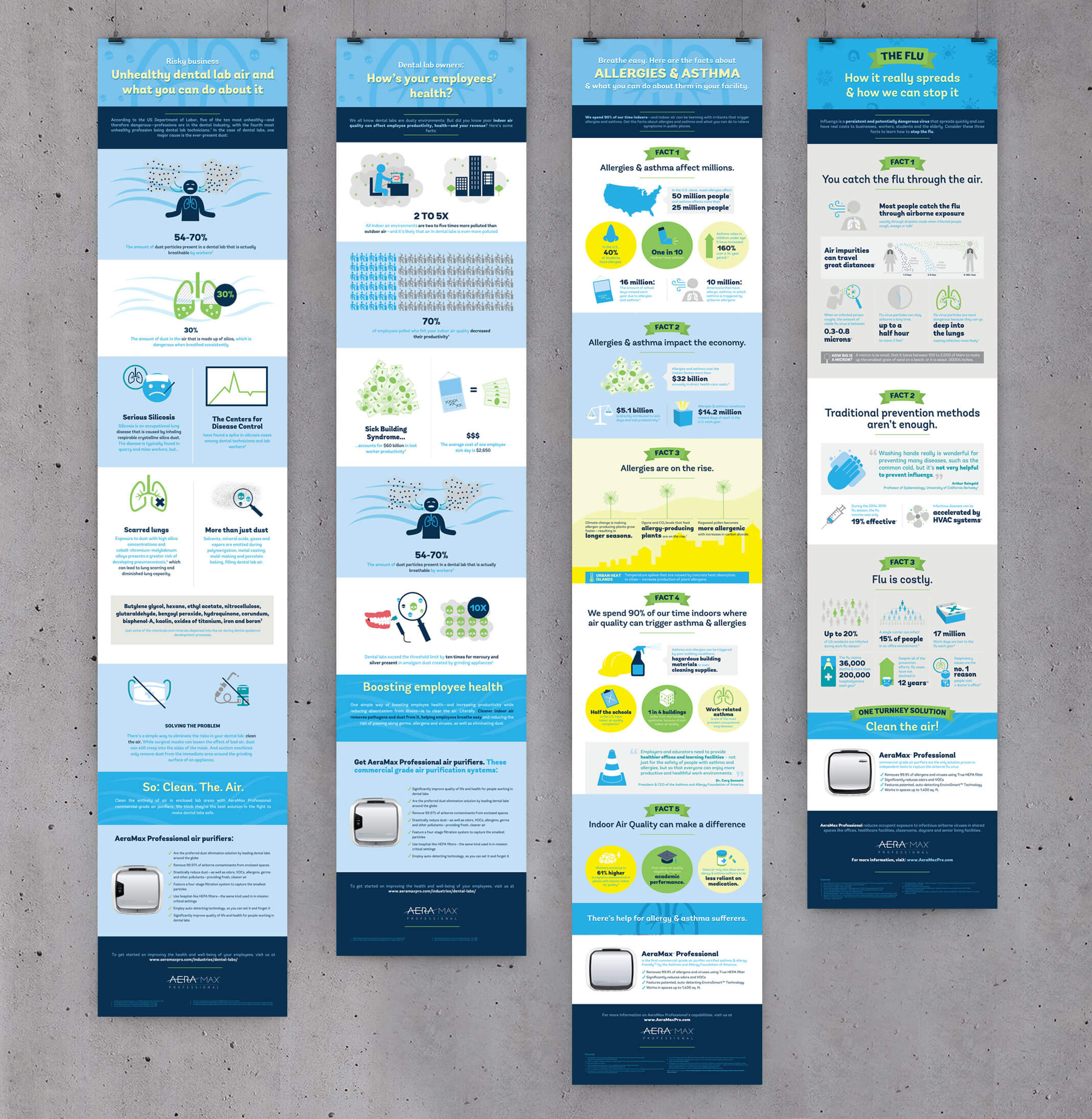
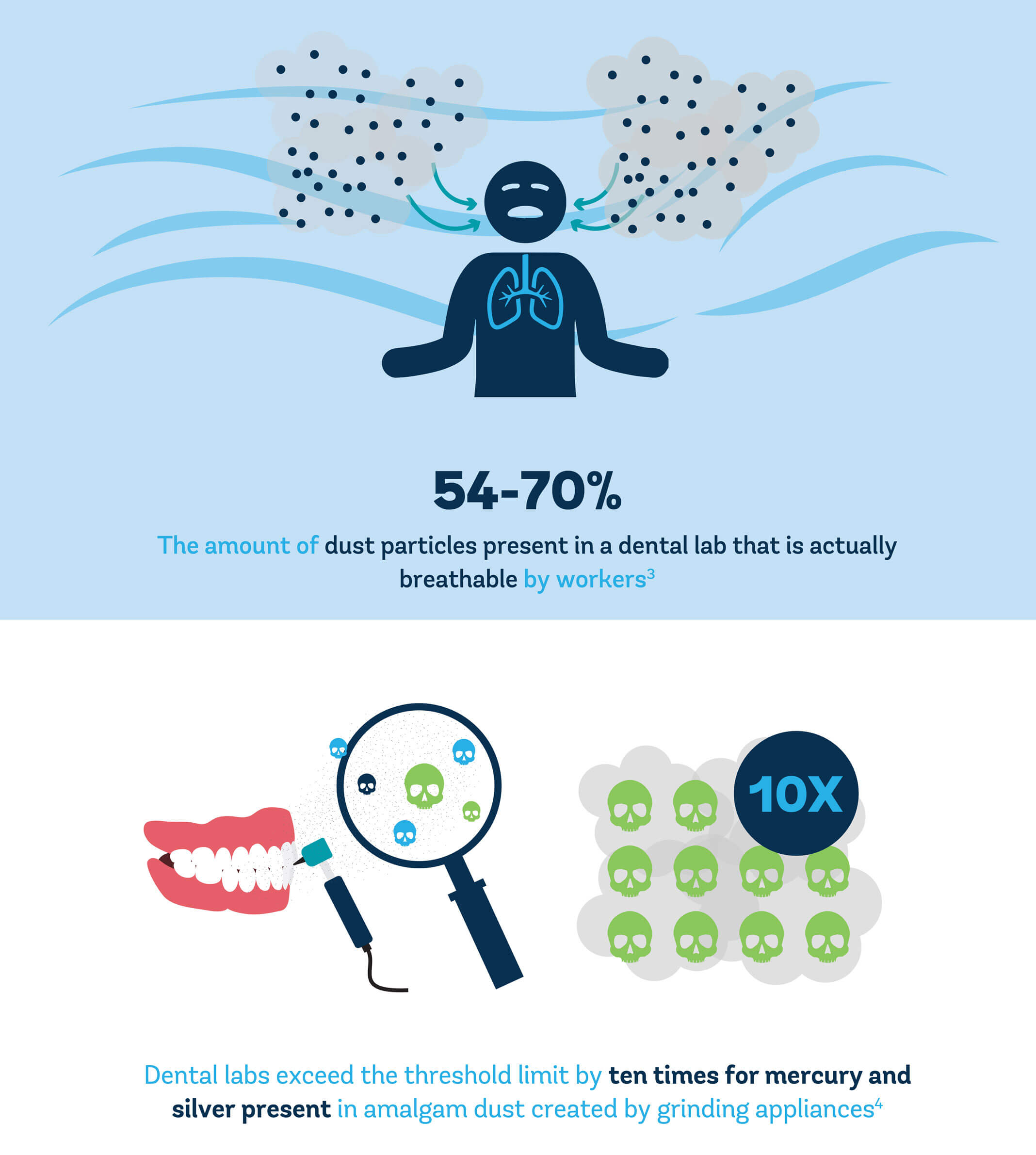
AeraMax Pro Infographics
We make it easy to understand.AeraMax Pro Infographics
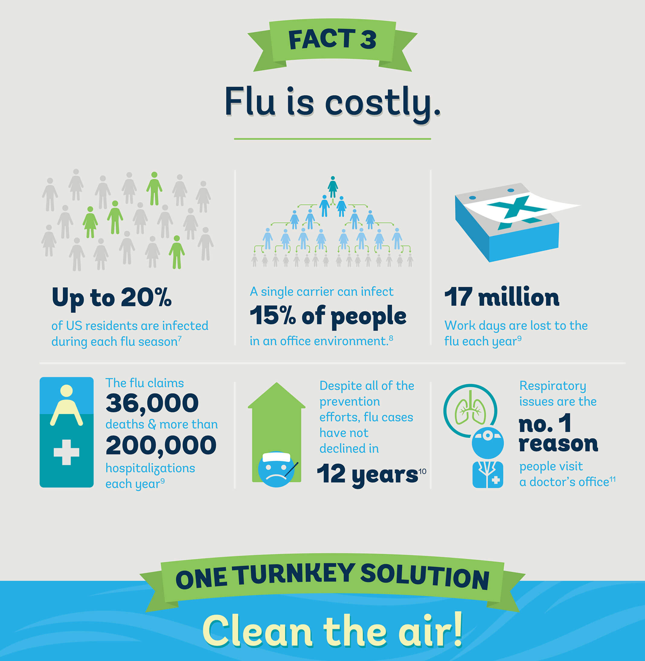
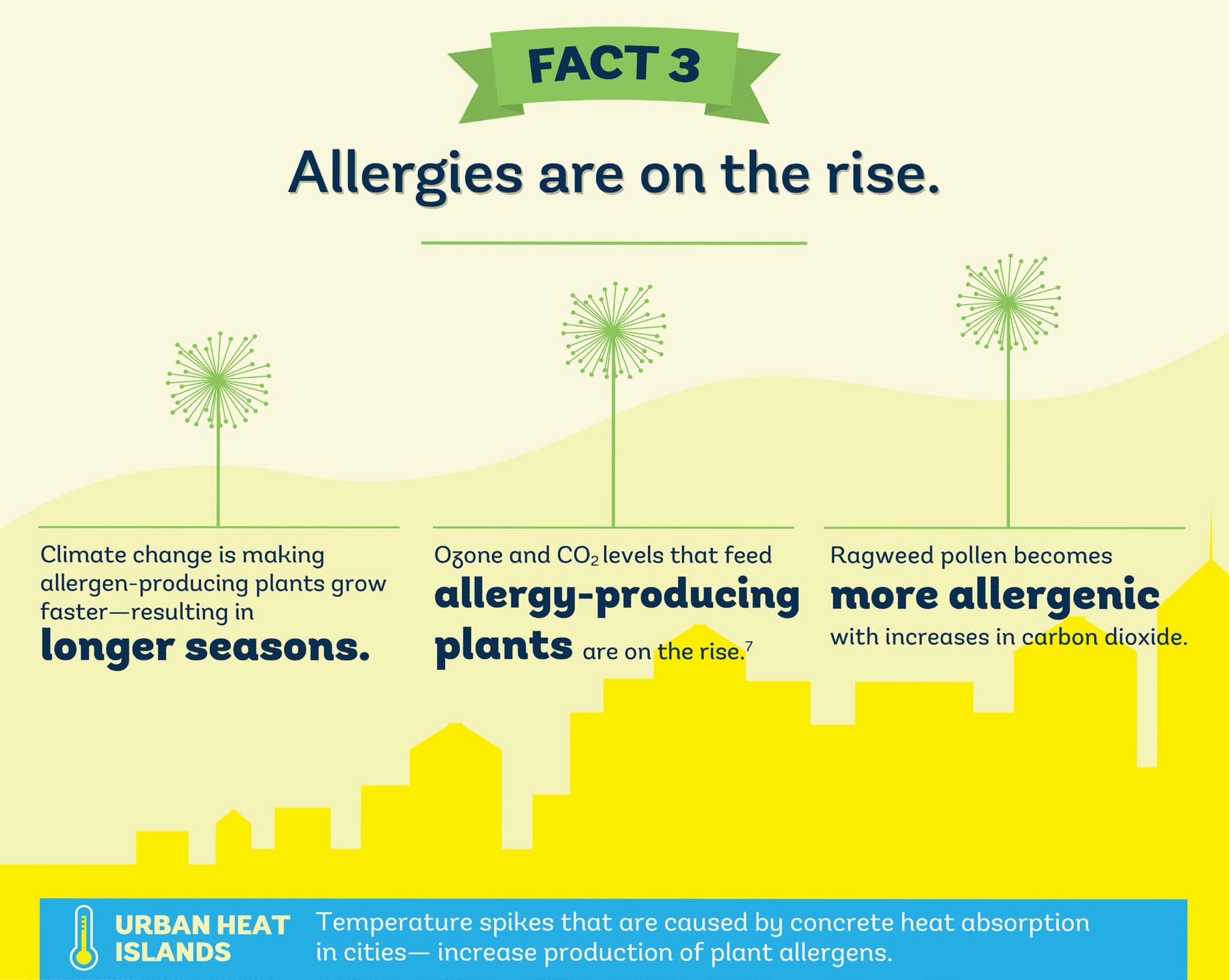
Sometimes, complex communication issues require a different approach. That’s why we focused on providing our client Fellowes with a raft of dynamic and visually based infographics to explain the benefits of its air purifiers to intended audiences. Given that the topics covered were often filled with scientific explanations, we broke down lofty—and sometimes dense—concepts into bite-sized and appealing forms.
First, we worked to create a common ground with audiences, using language in the captions that appealed to them. We distilled the topics into smaller chunks of information, setting about to showcase the copy in ways that would provide narrative scope, engagement and understandable visual cues.
Then, we create a graphic style, because we would be producing quite a bit of the infographics as a library. The style had to be recognizable as a Fellowes product and also had to be simple enough to be used in a variety of settings and disciplines, like websites, emails, flyers, PDFs and the like.
Once we sketched out each infographic, our crack design team transformed the graphics into digital art, marrying the pieces with copy in layout form.
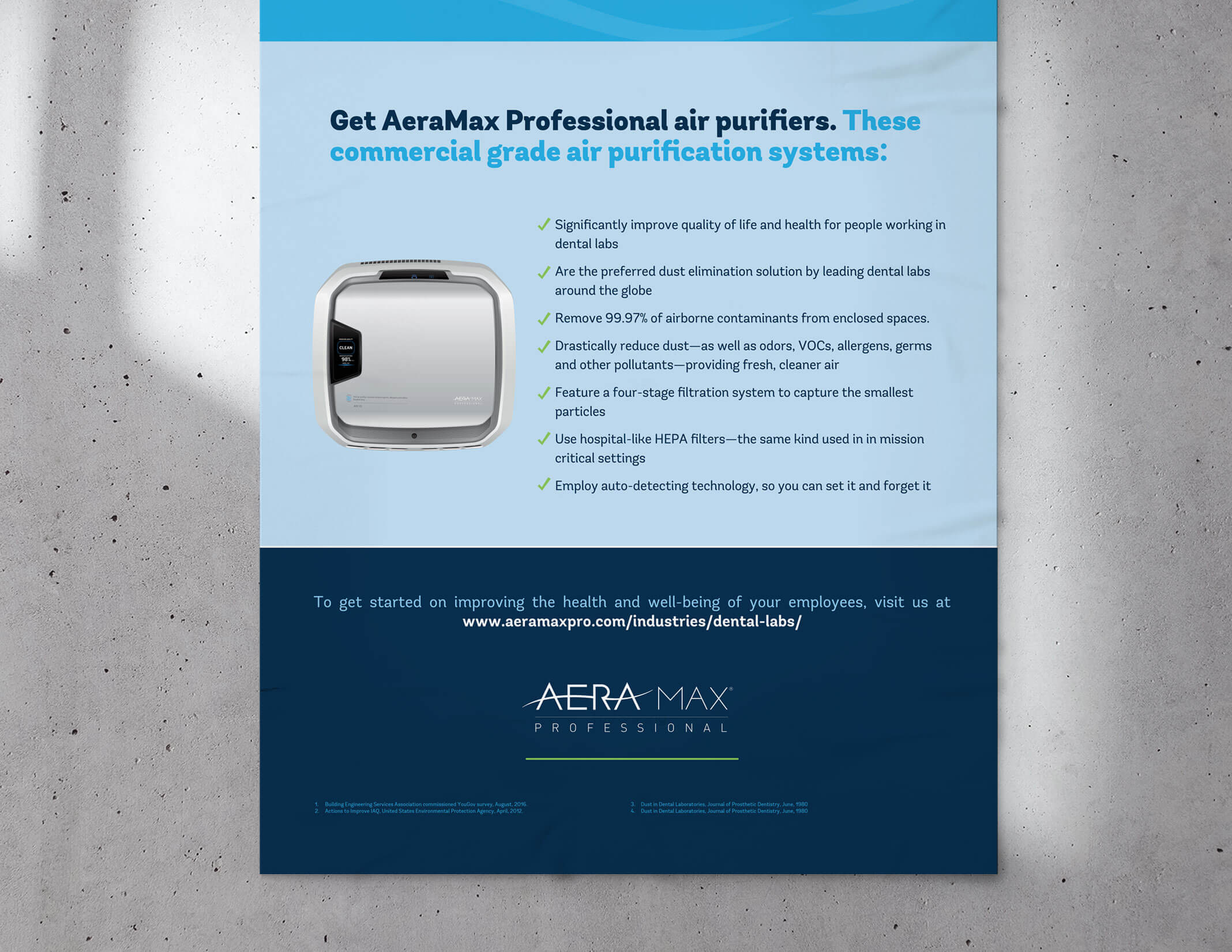
The result: communication pieces that succinctly informed a variety of audiences with important information about indoor air quality—and how Fellowes could help solve indoor pollution problems.
Category
Content

