Urban Farmer Web
We made it more than just tasty.Urban Farmer Web
Urban Farmer’s website looked like the Tuesday Night Special at Sal’s corner pizzeria: average fare topped with heaping helpings of everything but the kitchen sink. The site was not worthy of the preeminent purveyor of organic and gluten-free premium pizzas. So, we dug in.
First, we did a comprehensive assessment of the content on-site, working to understand the flow of information and the potential communications issues. Then, we addressed navigational woes by wireframing and mapping out potential user paths, determining the one-size-fits-all information depository approach of the existing site wouldn’t cut it. So, we created two interlinked site paths: one for consumers craving delicious pizza; and one for trade partners looking for co-manufacturing at its finest.
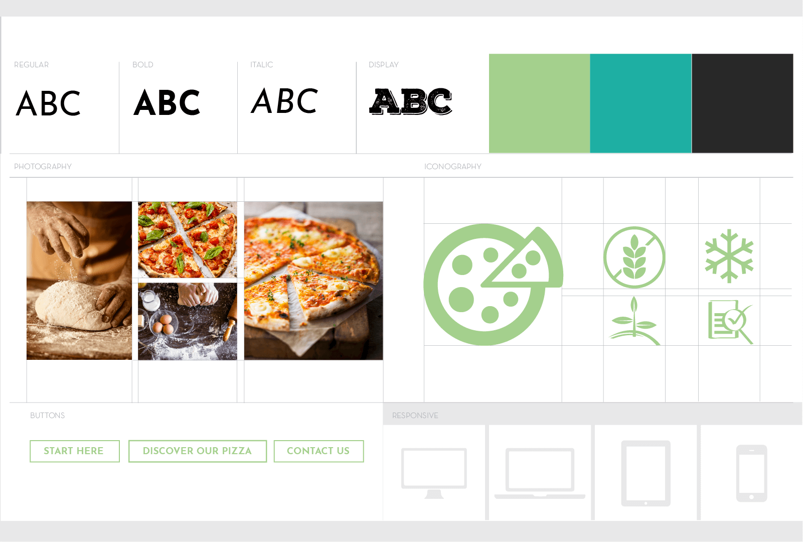
Then, we set about to ensure each path of the site spoke to its respective audiences with tonality that was on brand, inviting and embracing. Visually, we overhauled the look-and-feel of the website, providing eye appeal and clear message sets. The result: a site you could really sink your teeth into—one that truly reflected the appeal of Urban Farmer. Visit urbanfarmerpizza.com or urbanfarmer.net
Category
Digital


